

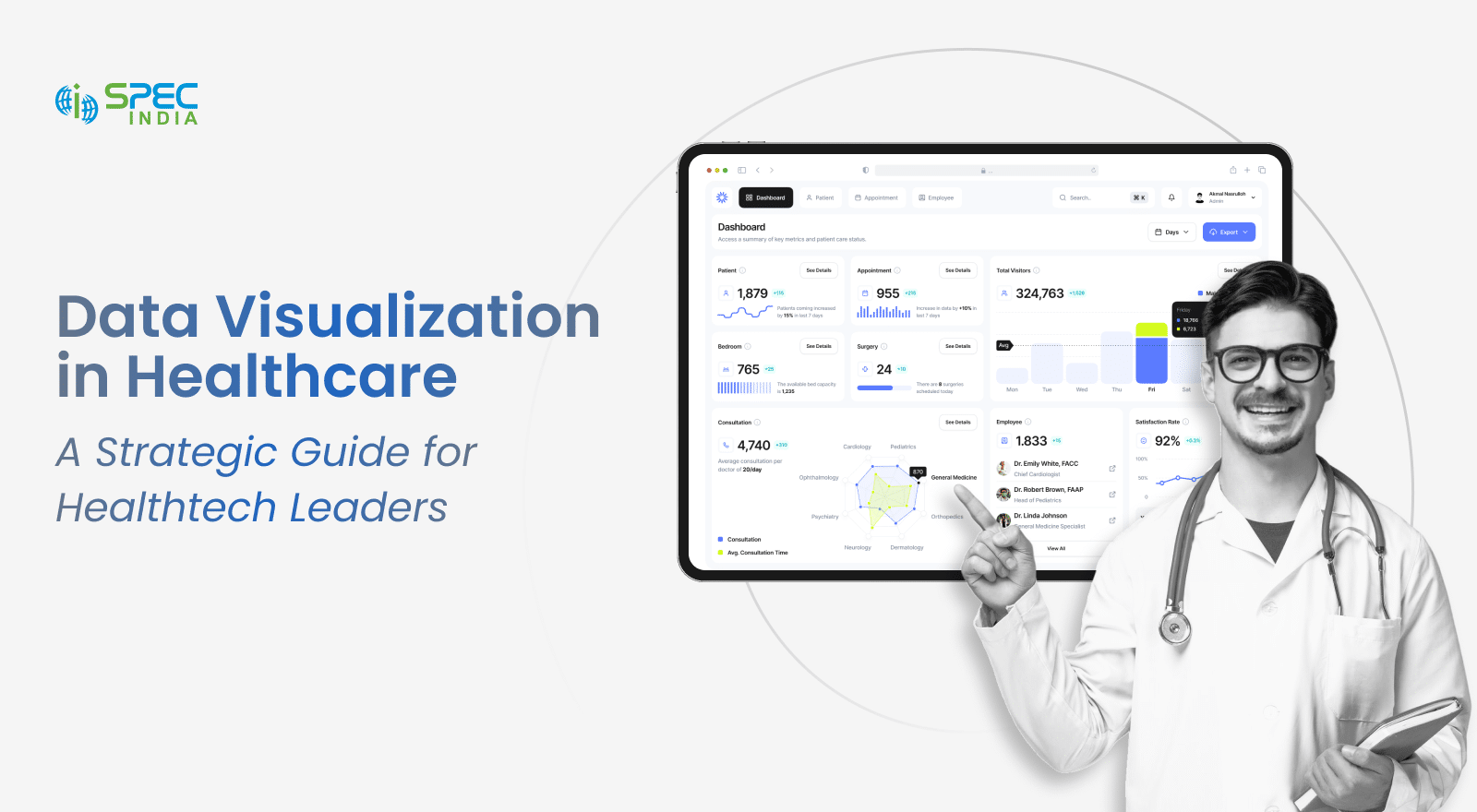
Data Visualization in Healthcare: A Strategic Guide for Healthtech Leaders
June 16, 2025
August 12th, 2025
Healthcare is one of the most significant data contributors. It collects vast amounts of data related to patients, diseases, and drug developments. According to grandviewresearch, the market size of healthcare data collection will be USD 526.6 Mn in 2021 and is expected to grow at a 26.9% CAGR by the end of the decade.
Yet, offering better healthcare services, especially in life-threatening conditions, is challenging. This is all due to not being able to process data effectively. Raw data is meaningless unless it is complemented with technology; the latter would enable processing, interpretation, and handling of the data so well that it supports healthcare professionals in treating conditions effectively. Or maybe it can aid in drug development as well.
This comprehensive guide on data visualization in healthcare is all about discussing:
- Benefits of Healthtech data analytics
- Real-life use cases for you before implementation
- Challenges, risks, and best practices for effective healthcare data visualization
Dive in to understand how data visualization can drive innovation and transform the future of healthcare delivery.
The Role of Data Visualization Across Healthcare Stakeholders
Healthcare data is a mine that, if strategically used, can yield actionable intelligence. It ramps up decision-making and aids in the treatment of diseases, surgeries, and drug development.
We have figured out how healthcare data visualization can benefit different stakeholders. Go through the section that applies to you and understand how it will help you.
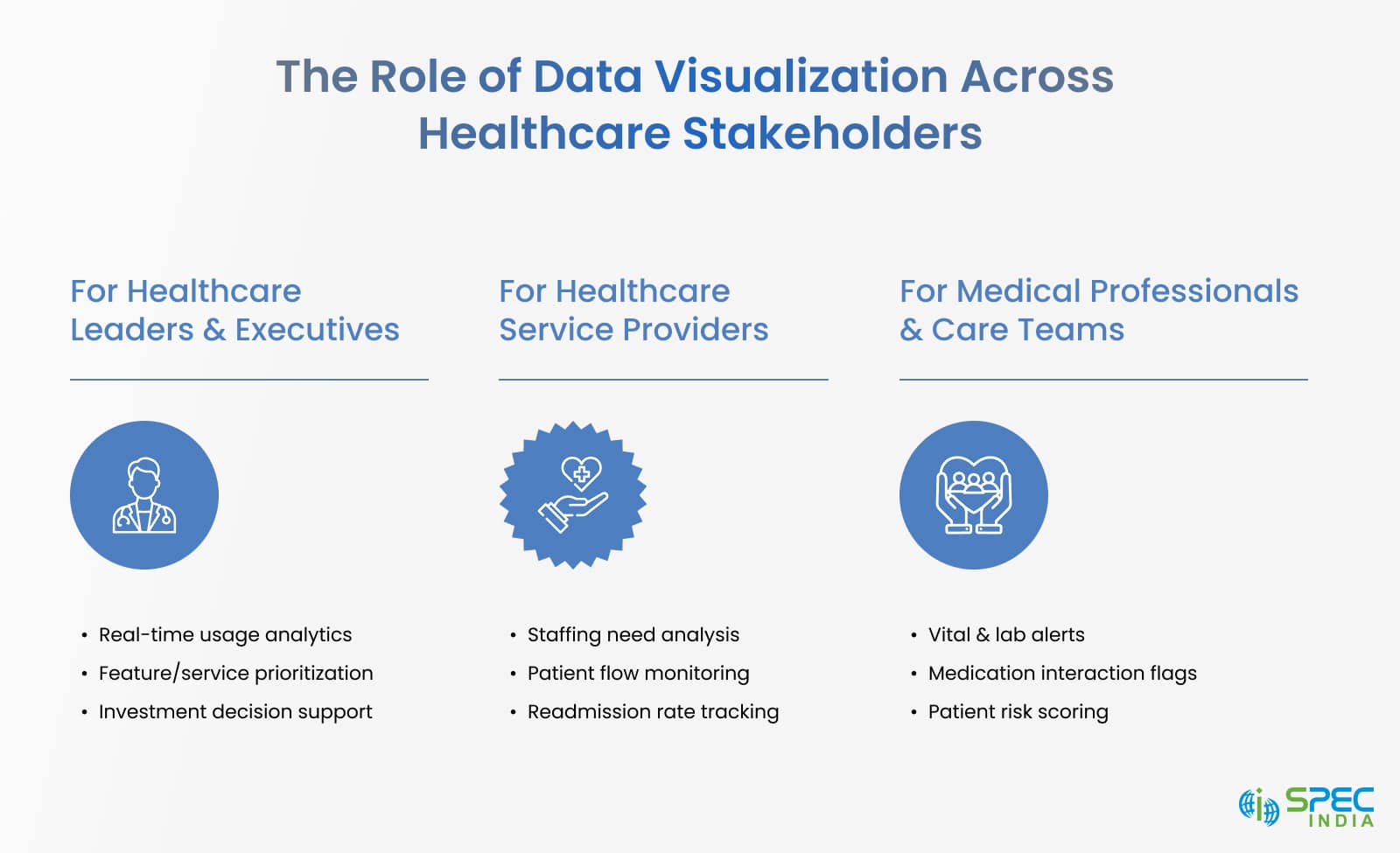
For Healthcare Leaders & Executives
Most healthcare leaders and executives must make investment and product roadmap decisions based on available data. However, these data are often fragmented, raw, and unstructured, which can pose challenges.
How will healthcare data dashboards help them?
- It shows real-time market and usage analytics with which the stakeholders will prioritize features/services that the consumers widely use.
- BI dashboard highlights patients’ engagements with products/services, operational loopholes, and revenue trends. As a result, you can make critical investment decisions.
- BI dashboards showcasing product/services impact and ROI generation.
For Healthcare Service Providers
This is the second funnel under which healthcare service providers fall. Their duty is to make critical decisions under severe conditions, maintain care quality, and improve operational efficiency. However, they face siloed and delayed information, which becomes a hurdle in achieving their goals.
How will medical data visualization help them?
- With a unified dashboard, healthcare professionals can identify bed occupancy rate, staffing requirements, ER waiting times, and patient flow.
- The report even shows patient readmission rates, infection control metrics, and discharge delay reasons to fix the bottlenecks and accelerate quality patient care.
- With the interactive dashboard, the involved party can identify the duration a patient occupies and the disease, too.
For Medical Professionals & Care Teams
Medical professionals and care teams must evaluate the large dataset from EHRs, lab results, and imaging within tight deadlines.
How will medical data visualization help them?
- With data visualization in healthcare, these teams help professionals identify patient vitals, abnormal lab results, and medication interactions.
- Help build a customized care plan with longitudinal patient data, which is presented in timeline-based visuals.
- Improves internal communications within teams with shared dashboards that provide patient status, risk scores, and other additional yet essential values.
Your Data Is Talking—Make Sure You’re Listening
Every patient outcome, operational delay, and missed opportunity is hidden in your data—until it’s visualized the right way. Healthtech leaders and providers are already turning raw information into real-time decisions with intelligent dashboards and tailored visual tools.
Don’t fall behind in a data-driven care economy.
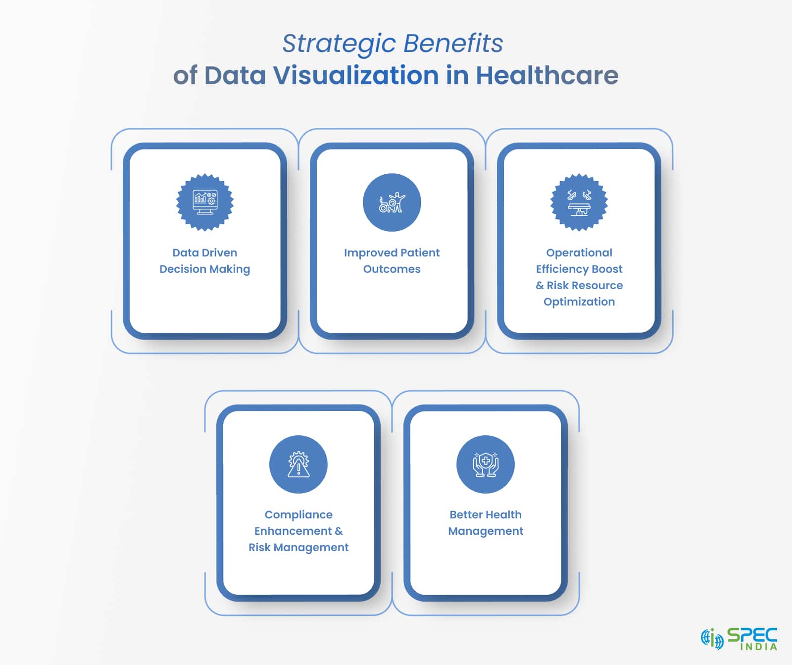
Strategic Benefits of Data Visualization in Healthcare
The healthcare sector depends entirely on decisions made through different data collection and processing. Interpreting data accurately is one of the key benefits of data visualization. It extracts meaningful insights that help treat health conditions and empower strategic excellence. Apart from the key drivers, there are other benefits as well:
-
Data Driven Decision Making
Healthcare data is all about patients’ vitals, conditions, diseases, and drug developments. With interactive dashboards, stakeholders can identify trends and correlations. Be it sudden spikes in hospital admissions (situations like COVID) or unusual patterns, data visualization in the healthcare sector is ready to help you.
-
Improved Patient Outcomes
Data visualization in healthcare is the most significant aid to clinicians or care providers. Through detailed reports, they can identify early warning signs of chronic diseases. In other cases, they can even prepare a care plan for patients. As a result, it improves patient care quality, reduces the chances of errors, and upgrades patient experiences.
-
Operational Efficiency Boost & Risk Resource Optimization
This technology adaptation benefit isn’t limited to patient care; it helps enhance hospital operational efficiency. You can identify patient wait times, underutilized staff, and bed shortages.
-
Compliance Enhancement & Risk Management
Along with providing qualitative patient care and fixing operational loopholes, data visualization tools even help highlight anomalies, audit trails, and compliance gaps. They help with risk tracking and reporting and ensure data governance by meeting strict standards like HIPAA, GDPR, and MACRA.
-
Better Health Management
Data visualization tools even help identify at-risk groups, track disease outbreaks, and assess the effectiveness of preventive care measures. They help build strategies in health emergencies.
Common Use Cases of Data Visualization in Healthcare
You have heard a lot about data visualization in healthcare, but now it’s time to know how to use it effectively. Below is a demonstration of what you can do with data visualization tools.
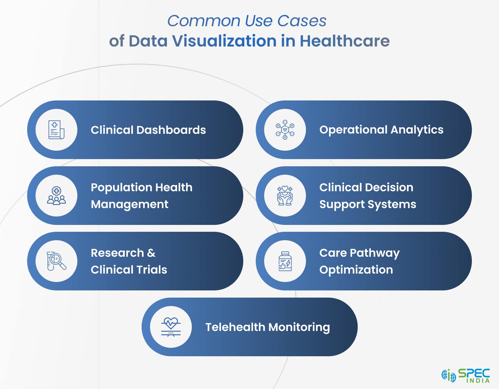
Clinical Dashboards
Purpose: Offer real-time and patient-specific insights to clinicians.
With a huge collection and ongoing data gathering activities, the dashboard will present core inputs like patient vitals, medication schedules, lab test results, and imaging findings in an interactive format.
- Healthcare professionals can easily identify patient health deterioration using color-coded lines.
- Nurses or support staff can provide medicines on time.
- Disease specialists can track the disease progression through intuitive visual timelines.
Impact: Clinical data visualization allows healthcare service providers to make prompt decisions. It also improves the quality of patient care and frees medical staff from unnecessary activities.
Operational Analytics
Purpose: To improve efficiency and agility in healthcare operations.
Healthcare facilities have constraints, like limited resources, high patient loads, and dynamic demands. With interactive visualization of staffing levels, bed occupancy, and patient flow, help administrators:
- Identify workflow bottlenecks
- Enhancement of shift scheduling and medical staff allocation
- Improve utilization of ICUs, ORs, and diagnostic equipment
Impact: Enabled frictionless patient journey, cost-effective, and operational waste reduction
Population Health Management
Purpose: Track health trends across demographics and regions
The dashboard would determine HER data, public health records, and socioeconomic indicators.
- Analyze chronic disease hotspots
- Determine high-risk patient groups for a proactive plan or outreach
- Analyze the impact of socioeconomic determinants
Impact: Facilitates focused interventions, lowers preventable hospitalizations, supports quality care initiatives
Clinical Decision Support Systems (CDSS)
Purpose: To advise healthcare professionals in making informed decisions
It presents complex real-time clinical data like disease risk scores, lab results, and historical patterns. Dashboards, trend graphs, and risk heatmaps are where everything is presented.
- Visual cues help in intervening early in high-risk cases
- Notifies with signals in case of patient deterioration and medication contraindications
- Visual differential diagnoses based on symptoms
Impact: Reduces diagnostic errors, improves care delivery, and enhances patient safety across departments
Research and Clinical Trials
Purpose: Visualizes patient data, trial metrics, and research outcomes
Visual dashboard in research settings helps with:
- Progress across study milestones
- Advice on event timelines
- Comparative drug response between the control and test groups
Impact: Ramps up decision-making, upgrades regulatory reporting, and enhances transparency
Care Pathway Optimization
Purpose: Analyzes and extracts gaps, delays, and redundancies in the patient’s journey
Data visualization tools like Sankey diagrams, funnel visualization, and flowcharts explain the following things:
- Delay in interdepartmental handoffs
- Unnecessary repeat tests and consultations
Impact: Makes care coordination better, reduces waiting times, and improves patient satisfaction through quality care
Telehealth Monitoring
Purpose: Track remote patient data in a visual format
- Telehealth platforms track users’ vital signs like heart rate, sleep patterns, and glucose levels.
- Notifies clinicians if needed to intervene
- Ensure no doctor-patient appointments are missed
Impact: Improves patient conditions, reduces hospital readmission rates, and supports virtual care teams
How to Implement Effective Data Visualization in Healthcare?
Data visualization tools offer actionable insights in the form of charts and dashboards. It helps healthcare professionals to take corrective actions on time, enhance operational performance, and get involved in strategic planning. Here is the breakdown:
Define Clear Objectives
Healthcare businesses must note what challenges they ideally want to solve with data visualization. With a proper idea of objectives, it will be easier to meet expectations.
Here is the sample breakdown:
- Clinical goals: Reducing diagnostic delays, tracking vitals, and predicting outcomes
- Financial goals: Identifying billing errors, reducing denials, and improving reimbursement
- Operational goals: Tracking utilization, streamlining workflows, and managing staffing.
Ensure Standardized Data Inputs
You can extract effective visualization from accurate and structured data from various sources, such as billing platforms, wearables, EHRs, and lab systems.
You can:
- Remove de-duplication, data cleansing, and normalization practices
- Leverage interoperability standards, such as FHIR, HL7, and SNOMED
- Break down data silos using APIs and secure integration
Choose the Right Visualization Tools
For the implementation of the data visualization, you must pick the right tool:
- Power BI: Cost-effective and great for operational dashboards
- Tableau: Interactive and feature-rich development
- Custom Dashboards: Best for HIPAA-compliant software, role-specific interfaces
- Embedded BI: Allows visual insights within apps or portals
Design User-Centric Interfaces
Data visualization aims to solve the problems of clinical and administrative teams. Due to this, the user interface should be simple and clear-cut:
- Use color coding, tooltips, and the hover feature to upgrade interpretations
- Build role-based views
- Ensure accessibility with contrast themes, multi-device compatibility
Ensure Compliance with HIPAA & Data Security Standards
Compliance is non-negotiable in industries like healthcare, which is why it is necessary to implement:
- Data masking, protection, encryption, and audit logs
- Implement access-based control
- Choose HIPAA-compliant hosting environments
That’s how you implement data visualization in healthcare. For more details, you can always connect to a data visualization services provider.
Conclusion
Data visualization aids healthcare professionals in making strategic decisions, which mostly revolve around patient care and operational efficiency. Ensuring the proper transformation of complex data into actionable insight helps clinical teams, medical staff, and executives respond faster, work smarter, and deliver better outcomes.
Healthcare as an industry focuses on improving efficiency, reducing costs, and elevating patient care. Dive into data visualization for detailed outcomes related to patient care, telehealth, and operational efficiency.
Frequently Asked Questions
As discussed earlier, healthcare is one of the largest data producing sectors in the world. It ranges from patient records to test results and billings to operational metrics. The interpretation and act upon deficiency makes the data overwhelming. If you implement data visualization in healthcare, it simplifies complexities, helps healthcare professionals to take informed decision based on the patient’s conditions, drug developers can make efficient drugs for chronic and severe diseases, and hospitals can improve their operational efficiencies.
Healthcare data visualization has various use cases, which are as follows:
- Clinical Dashboards: tracks trials, lab results, and patients’ progress in real-time
- Operational Analytics: optimize medical staffing, resource allocation, and medical workflows
- Population Health Management: monitor chronic conditions and social health determinants
- Financial Insights: Analyze claims, revenue cycles, and reimbursement patterns
- Telehealth Monitoring: represent remote patient’s data visually from wearable devices
- Research and Trials: monitor drug progresses, visualize adverse conditions, and compare drugs and its side effects
Data visualization has several benefits out of which one is being proactive rather than reactive. With predictive healthcare, you can know in advance about the upcoming conditions. Several crucial benefits are:
- Identifying anomalies like billing discrepancies or unusual vitals
- Helping with proof-oriented patient care through predictive modeling and risk scoring
- Fast insight presentation through interactive healthcare dashboard that presents real-time updates
- Enabling collaboration by offering shared visuals across departments
Healthcare leaders leverage data visualization to develop scalable and compliant analytics solutions for healthcare service providers. They can even upgrade their product offering by integrating insights into CDSS, EHRs, and patient portals. You can even build custom dashboards for your stakeholders. Lastly, it helps in driving digital transformation and differentiates their solutions with enticing and detailed view interfaces.
The best practices that need to be followed for effective data visualization in healthcare are:
- Determining the purpose of visualization, meaning clinical monitoring, operational monitoring, financial reporting, or population health evaluation.
- Ensuring accurate data with zero duplications and leveraging standards like FHIR, HL7, and SNOMED for consistency.
- Customize visualization, use intuitive interfaces and interactive elements.
- Avoiding cluttered visuals to make informed decisions.
- Ensure dashboards are responsive and accessible
SPEC INDIA is your trusted partner for AI-driven software solutions, with proven expertise in digital transformation and innovative technology services. We deliver secure, reliable, and high-quality IT solutions to clients worldwide. As an ISO/IEC 27001:2022 certified company, we follow the highest standards for data security and quality. Our team applies proven project management methods, flexible engagement models, and modern infrastructure to deliver outstanding results. With skilled professionals and years of experience, we turn ideas into impactful solutions that drive business growth.
Table of contents
Delivering Digital Outcomes To Accelerate Growth
Let’s TalkTable of contents
Delivering Digital Outcomes To Accelerate Growth
Let’s TalkRelated Blogs
Let’s get in touch!
India
SPEC House, Parth Complex, Near Swastik Cross Roads, Navarangpura, Ahmedabad 380009, INDIA.
-
 +91-79-26404031, 32-33-34
 -
 [email protected]
