

Top 15 Power BI Dashboard Examples For Better Insights
July 26, 2022
September 4th, 2025

There is a vast difference between collecting data and using it.
Every company understands the importance of data, but most struggle to uncover its full potential.
The volume of data keeps rising, and data technologies change every other day. This makes it more difficult for organizations to benefit from data investments and place a data-driven strategy across the organization.
People understand data differently. Good data-driven strategies that make a base for informed decisions can’t be created without people invested. But, you must make data visualizations compelling and easy to understand to earn people’s attention.
At this moment, many powerful and advanced data analytics and data visualization tools made it possible to quickly create powerful and engaging visualizations. Power BI visualizations are one of the easiest ways to start your data visualization journey and tell a fantastic data story.
Data visualization is the graphical representation of data through dashboards, interactive reports, charts, graphs, and other formats.
Data visualization with Power BI enables anyone to collect, prepare, analyze, and visualize data in minutes and help make better business decisions. Dashboards are an essential visualization format that provides 360-degree views and helps quickly gain insights.
In this blog, we are showcasing the 15 Power BI Dashboard Examples that help you understand how Power BI can be used to illustrate different scenarios and offer insights through well-designed and carefully selected KPIs.
Before we start, let’s first go through a quick introduction to Power BI dashboards.
What is Power BI Dashboard?
A Power BI Dashboard is like a canvas used to tell a story. It presents the most critical data points in various elements within one page.
It is an entry to the reports that are based on the dataset. Well-designed dashboards contain only essential points of the data store. If you select or click a particular tile (snapshot of data), it will take you to the main report from where it is taken.
Dashboards are suitable for monitoring your business performance, sales performance, or any critical parameters at a glance. They offer a bird’ s-eye view of your business and help you create data-backed strategies for future actions.
Dashboard in Power BI may come from one or many reports or underlying datasets or many. It represents a consolidated view of essential business metrics.
This single-page visualization in the Power BI dashboard automatically refreshes when the dataset updates. Thus, you can track the data that matters the most in real-time.
A Power BI Dashboard is easy-to-understand, easy to create, intuitive, and user-friendly. It supports data sources such as Excel, Text/CSV, IBM DB2, MySQL, SQL Server database, JSON, Access database, and PDF.
The Power BI dashboard allows you to analyze data, identify patterns, and extract insights that help you make informed decisions.
Power BI Dashboards Can Be Used To Show
- Overall sales performance of a business
- Entire customer acquisition funnel
- How does the sales number compare to different periods
- Healthcare KPIs covering various metrics, demographics, and scenarios
- Customer service and how long it takes to resolve issues
- Top-performing products in terms of profitable revenue
- Social media monitoring and analytics
- Patient management and demographics
- Inventory analysis and management
- Hospitality management
- Time-tracking and project management
- Sentiment analysis and brand engagement
Several scenarios and parameters can be used to create a dashboard. Before creating a Power BI dashboard, you need to decide on users who will use it, such as managers, sales representatives, executives, decision-makers, or everyone in the organization.
Do You Know?
Microsoft was named a Leader in the 2024 Gartner® Magic Quadrant™ for Analytics and BI Platforms.
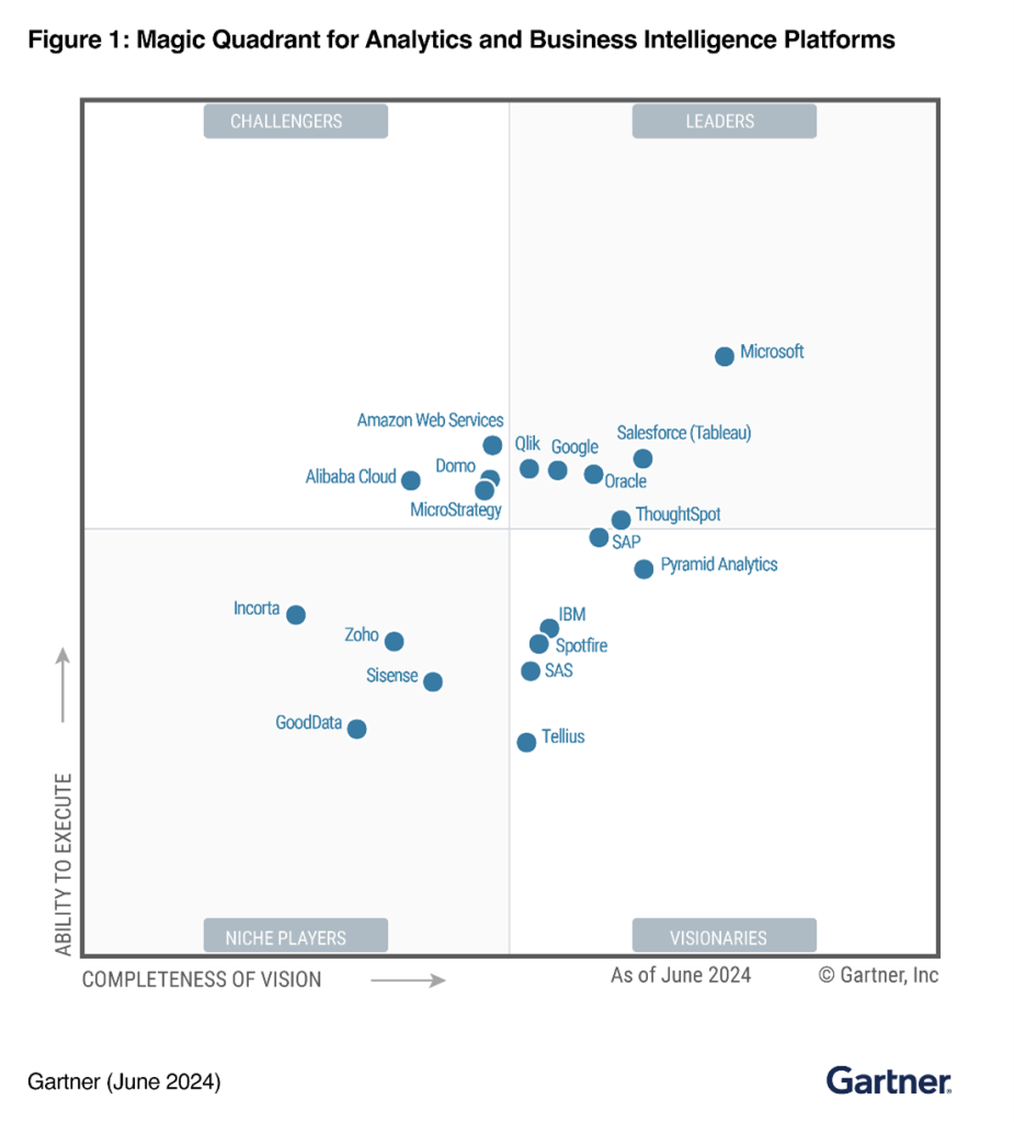
Source: Gartner
Let’s look at famous examples of Power BI dashboards. Each tells a different data story, creating a foundation for data-powered decision-making.
15 Power BI Dashboard Examples: Derive Actionable Insights
1. Sales Analytics Report
This Power BI sales dashboard visualizes sales performance and growth with all possible metrics and demographics. The well-placed tiles and graphs make it easier to measure the ‘How is your company doing?’ status.
This sales analysis dashboard in Power BI covers important parameters and KPIs such as primary and secondary sales by period and segments, as well as sales by brand, product code, state, partner, and dealer name. You can also compare sales and profits against the previous years and apply a filter based on segments, year, product, and dealers to get general sales to view over the specific period.
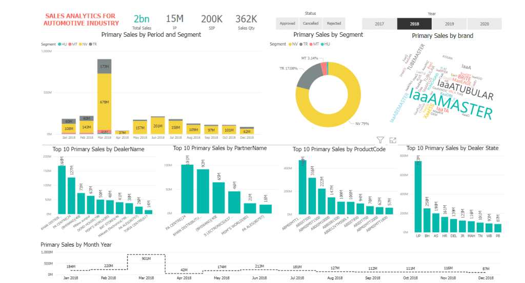
You can also compare sales performance by year to have an at-a-glance view of sales activities. This sales analytics dashboard covers the sales team’s performance and can be used by sales leaders and managers to create data-driven strategies. It has three pages covering primary sales details, secondary sales details, and primary and secondary sales with inventory valuation.
It may include various vital metrics that are required by the sales team to manage and track their performance.
2. Inventory Stock Analysis Dashboard
Power BI offers easy-to-understand visualizations with a visually appealing and intuitive user experience.
This Power BI inventory dashboard is one of the important examples of Power BI dashboards that can be used in various industries, such as retail, FMCG, manufacturing, hospitality, education, restaurants, and businesses of any size, to operate smoothly and keep up with customer demand.
Inventory management is vital to keeping track of the goods and stock needed to function correctly. Inventory dashboards offer greater stock visibility and allow you to manage inventory effectively in real-time.
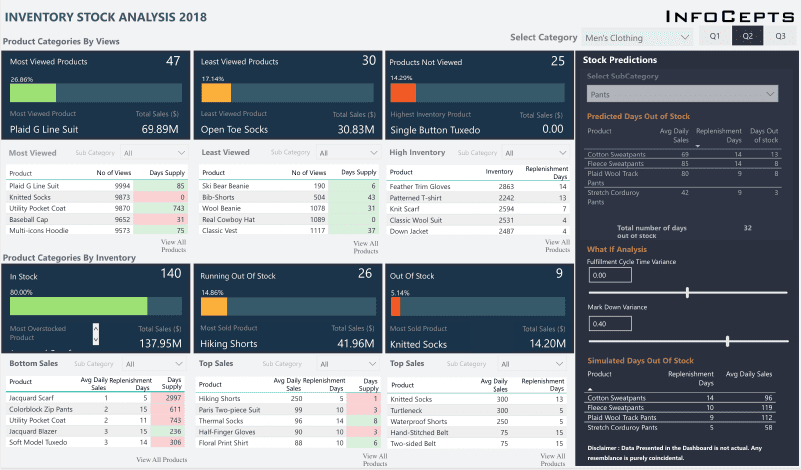
This Power BI inventory dashboard provides insights into customers’ product views and inventory. You can also see the most viewed, least viewed, and unviewed top 5 products. This inventory analysis dashboard provides a percentage-based classification of total apparel sales.
It allows you to see segmented data, such as data for sales and inventory for quarters and gender-based clothing. Using this inventory dashboard, you can predict the availability of stock and the time to restock based on the Fulfillment Cycle and MarkDown variance.
3. Mall Analysis Dashboard
This dashboard is a perfect Power BI dashboard example for any shopping center, mall, plaza, or arcade with more than one brand of stores and outlets.
It offers an at-a-glance view of customers who visited and sales made by various stores. You can also see data by category, such as footwear, clothes, groceries, etc. Using this dashboard, you can compare current and previous months against the targeted goals.
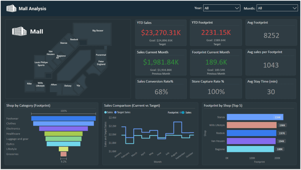
You can also view the data of a particular store by clicking the store in the top left corner. This mall analysis dashboard also displays the top five stores with the most customer visits and sales.
This dashboard helps you make critical marketing decisions and strategies based on customer behavior and interests. It also reveals the mall’s foot traffic and potential buyers.
4. Social Media Monitoring & Analytics Dashboard
Today’s businesses must use social media for their marketing activities. Social media is an important part of any business’s marketing strategy.
This Power BI dashboard represents a famous snack brand’s social media monitoring and analytics. It offers detailed insights into social media reaches, mentions, sentiments, and users.
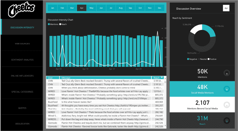
A social media analysis dashboard can be used to create marketing strategies, improve sales, understand users, and manage a business’s branding.
This dashboard covers web sources, users, geolocation, online influencers, discussion intensity with mentions and reaches, quotes with positive and negative categorization, etc.
5. Patient Management Analytics Dashboard
With all the necessary KPIs and metrics, this patient management analytics dashboard is one of the best examples of Power BI dashboards showing how to monitor real-time metrics to make data-driven decisions.
It is a data-rich and interactive dashboard showing crucial information such as the total number of patients, patients in ICU, physicians, departments, country, state, city, patients who died, readmitted patients, and average days of discharge. You can also see average waiting times to identify busier departments than the others, along with ideal waiting times. It also shows the number of patients by LOS Bucket, patients by hospital, age group, and discharge type.
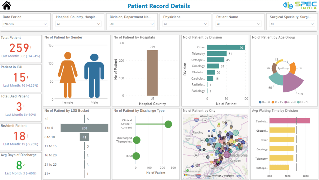
It can be used by multispecialty hospitals or a chain of hospitals to manage all areas and departments of hospitals in different cities and states.
The patient management dashboard helps administrators make timely decisions and proactively identify critical trends and patterns from the data.
6. Property Developer Sales Analytics Dashboard
This dashboard presents the real estate sales dynamic. It shows detailed information in eye-catching visuals in three parts: central, sales team, and call center.
This Power BI dashboard shows property developers’ sales analytics with critical indicators and call center details. The cards in the main dashboard represent total sales by projects, finance, and marketing details.
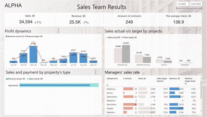
The second dashboard displays the efficiency of the team’s cold calls, including the conversion rate, average number of calls, and visits by the manager. The different visuals also present conversions from calls to deals and actual and target sales comparisons. The last page shows sales details with profit dynamics by month and a comparison of actual and target sales.
A well-designed tile lets you check revenue by property type and see the manager’s sales rate. It is a handy dashboard for real estate and other property management businesses.
7. Retail Dashboard
Data visualization is widely used in retail, and it allows retailers to benefit from data-backed decisions to grow their eCommerce businesses.
It is one of the famous examples of power BI dashboards showing all-inclusive retail metrics with a 360-degree view. It is a comprehensive retail analytics dashboard offering the best data visualization experience through a clean, elegant, and well-designed template. You can access all the required information, such as gross sales, profit, countries served, items sold, and the best month for receiving orders in a single go.
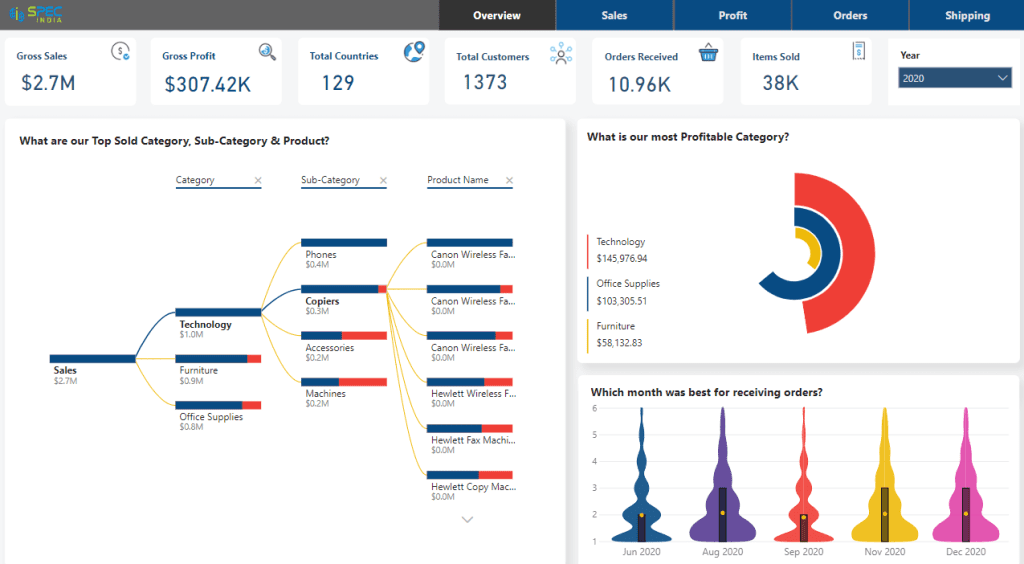
One of the highlighted parts of this dashboard is you can show the top-sold category, sub-category, and product.
This retail Power BI dashboard has five pages. Starting with the overview, the other four important metrics are sales, profits, orders, and shipping. It covers all-inclusive KPIs and also offers Power BI row-level security features to control access and implement restrictions based on user authentication and roles.
Directors, sales managers, leaders, retail managers, and anyone involved in planning and strategic decision-making can use it to increase growth.
8. Attendance Tracker Dashboard
This attention tracker dashboard is vital for educational institutes to track students’ attendance and identify areas of improvement to increase engagement.
This powerful Power BI dashboard example shows how row data can be converted into information in an elegant and clear format. It includes many data points from different classrooms, teachers, and schools.
![]()
This simple yet rich dashboard shows district-wise status, absence percentage by subjects/faculties, opportunities by school (the most important schools to work with), and conversation topics (detailed data on teachers, course, period, and day of the week).
The district status report displays attendance trends, goals, and predicted data for the upcoming month. This data visualization aims to provide administrators with a high-level understanding of engagement between administrators, teachers, and students.
9. Call Center KPI Dashboard
A call center power BI dashboard presents metrics and required KPIs that allow managers to monitor and optimize performance.
It tells the data story of a call center in clear, easy-to-understand, and intuitive visual formats that help managers and authorized personnel track each agent’s performance. Power BI dashboard examples with data help you understand how Power BI can be used for various data visualization needs.
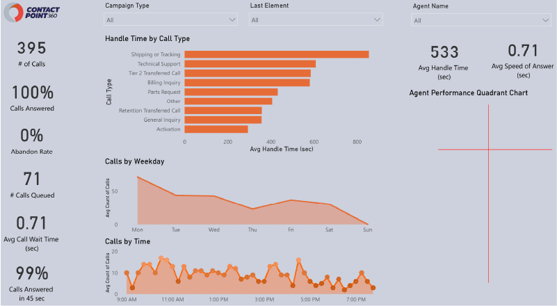
This call center analysis dashboard shows the number of calls, abandonment rate, queued calls, average call wait time, and time taken to answer calls. You can view the agent’s performance, campaign type, call type, last element, calls by weekday, and time.
10. Financial Analytics Dashboard
This is an ideal Power BI dashboard example for overseeing your finances and gaining an overview of your total income and expenditure. This financial analytics dashboard includes key performance indicators (KPIs) that help management make data-driven decisions based on the insights.
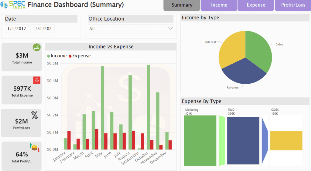
It displays income by month, location, time range, total revenue, sales, and expense details by department, month, and period, as well as an overall comparison of income versus expenditure through a bar chart.
It can be used by store owners who own multiple stores in different locations and shopping environments, such as airports, bus stops, plazas, and malls.
11. Pharmaceutical Company Dashboard
This power BIBI dashboard example highlights the status of pharmaceutical companies’ KPIs. Executives and managers can utilize this dashboard to track trends, performance, and sales against established sales targets.
It is a one-page report that clearly and nicely shows all relevant data. You can choose a city to see regional sales performance and team results, along with networking targets, the percentage of positive responses, and the number of contracts per day.
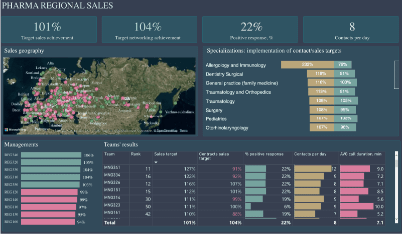
The bar chart and matrix display the results of every department and sales manager. They work for pharmacy companies with distributed offices worldwide, and their sales managers interact with local pharmacists to promote their brands.
12. CEO Dashboard
If you are looking for examples of CEO dashboards, this Power BI executive dashboard is for you. It offers the CEO(Chief Executive Officer) a high-level overview of important KPIs and metrics.
This CEO dashboard offers valuable insights into an organization’s performance. It helps higher-level executives make data-informed decisions and strategically plan a future roadmap. It provides a comprehensive overview of organizational information and business growth.
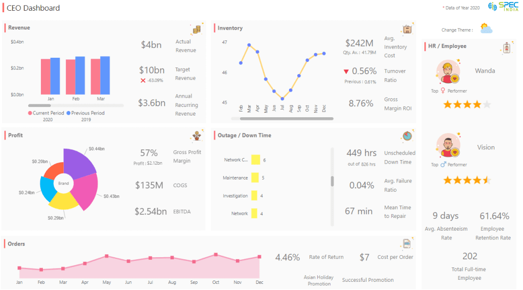
It includes several essential business areas such as inventory, profit, revenue, performance, orders, outages, top employees, etc.
It shows month-wise performance, orders, full-time employees, gross profit margin, actual revenue, target revenue, average failure ratio, unscheduled downtime, return and cost values, and inventory stats.
This is one of the perfect examples of Power BI dashboards for CEOs and higher-ranking officials to have a 360-degree view of business activities. They can use this data to identify opportunities, trends, and areas of improvement.
13. Trading Information Dashboard
This trading information dashboard in Power BI helps you understand interesting trading analytics in Europe.
It consists of four pages, converting huge data tables into an exciting, easy-to-understand format. Using this dashboard, you can get information about trading developments in the top ten European countries by GDP during 2015-2019.
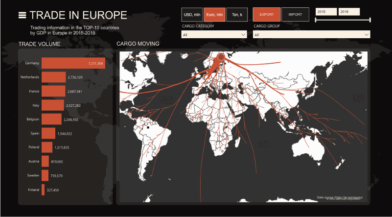
What Will You Get To Know?
- Who was the leader in a particular period?
- What was the most buyable and least sellable cargo category?
- Which transport was used the most for those cargoes?
- A rating of cargo groups
- Global trade dynamics with year-wise trade volume in ton, trade volume Euro, and CAG
- Trade by countries, categories, and dynamics by mode of transport
- Export-import trade numerals by countries – partners
- Cost dynamics by category and trade volume by groups
This trade analysis dashboard can be utilized for data-driven decision-making. It offers many insights into trade, export-import data, and countries with profitable trade and sales.
It is well-presented with various filters and easy on the eye. This dashboard makes data stories more compelling and understandable, enabling us to view data with simplicity and relevancy.
14. Time Tracking Dashboard
This easy-to-use, simple, and effective time-tracking power BI dashboard summarizes employees’ time-tracking data. This dashboard shows employees’ productivity, applications, tasks, and intervals during the day or a specific period.
![]()
It Includes:
- Productive/unproductive/neutral time of employees
- Top 5 applications by productive time along with interval and total time spent on the application (hover on the application name to see this)
- Bottom employees by average productive time
- Productive time in a specific 1-hour interval
- View employees’ arrival and exit time along with total break time
- Overall productivity percentage for a selected time range
- Productive time of an employee with a monthly comparison to the current date
- Current and previous day’s productive time for a particular period
- Green color when productivity is above 85% and red when it is below 85%
- Total break time and total time at the desk
- Project and task-wise time taken for a particular date or a month
- The project takes total time along with task details
This time-tracking Power BI dashboard helps business owners, managers, HR, team leads, and other senior employees monitor time and plan wisely. With the visualized data, top management can make better and faster decisions, improve performance, and streamline delivery.
15. Sentiment Analysis Dashboard
This is one of the useful Power BI examples that can be used by any global brand or large organization to manage its brand through sentiment analysis and social media traffic.
It is part of an 8-page report on online brand monitoring and offers insights into user sentiments associated with brands. You can select a particular time range, sentiment type, and source, and it shows mentions by category for that period.
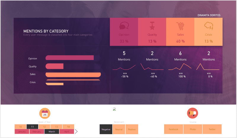
There are four main categories, and every user message is classified into these categories to identify how happy or disappointed your customer is with your products/services.
This type of sentiment analysis is a great way to observe customer data and share insights with your team for branding and reputation management.
Conclusion
Power BI is a widely used tool for visualizing and analyzing data. This article includes the top Power BI dashboard samples and shows how Power BI can gain actionable insights from relevant data.
Data has the potential to keep you informed about any future risks and opportunities that you can’t afford to miss. Data literacy is essential for an organization to understand, read, and work with data. It empowers everyone at every level and enables anyone to go beyond analysis to interpret data and make data-backed decisions.
SPEC INDIA is your trusted partner for AI-driven software solutions, with proven expertise in digital transformation and innovative technology services. We deliver secure, reliable, and high-quality IT solutions to clients worldwide. As an ISO/IEC 27001:2022 certified company, we follow the highest standards for data security and quality. Our team applies proven project management methods, flexible engagement models, and modern infrastructure to deliver outstanding results. With skilled professionals and years of experience, we turn ideas into impactful solutions that drive business growth.
Table of contents
- What is Power BI Dashboard?
- 15 Power BI Dashboard Examples
- Sales Analytics Report
- Inventory Stock Analysis Dashboard
- Mall Analysis Dashboard
- Social Media Monitoring & Analytics Dashboard
- Patient Management Analytics Dashboard
- Property Developer Sales Analytics Dashboard
- Retail Dashboard
- Attendance Tracker Dashboard
- Call Center KPI Dashboard
- Financial Analytics Dashboard
- Pharmaceutical Company Dashboard
- CEO Dashboard
- Trading Information Dashboard
- Time Tracking Dashboard
- Sentiment Analysis Dashboard
- Conclusion
Delivering Digital Outcomes To Accelerate Growth
Let’s TalkTable of contents
- What is Power BI Dashboard?
- 15 Power BI Dashboard Examples
- Sales Analytics Report
- Inventory Stock Analysis Dashboard
- Mall Analysis Dashboard
- Social Media Monitoring & Analytics Dashboard
- Patient Management Analytics Dashboard
- Property Developer Sales Analytics Dashboard
- Retail Dashboard
- Attendance Tracker Dashboard
- Call Center KPI Dashboard
- Financial Analytics Dashboard
- Pharmaceutical Company Dashboard
- CEO Dashboard
- Trading Information Dashboard
- Time Tracking Dashboard
- Sentiment Analysis Dashboard
- Conclusion
Delivering Digital Outcomes To Accelerate Growth
Let’s Talk


Let’s get in touch!
India
SPEC House, Parth Complex, Near Swastik Cross Roads, Navarangpura, Ahmedabad 380009, INDIA.
-
 +91-79-26404031, 32-33-34
 -
 [email protected]
