

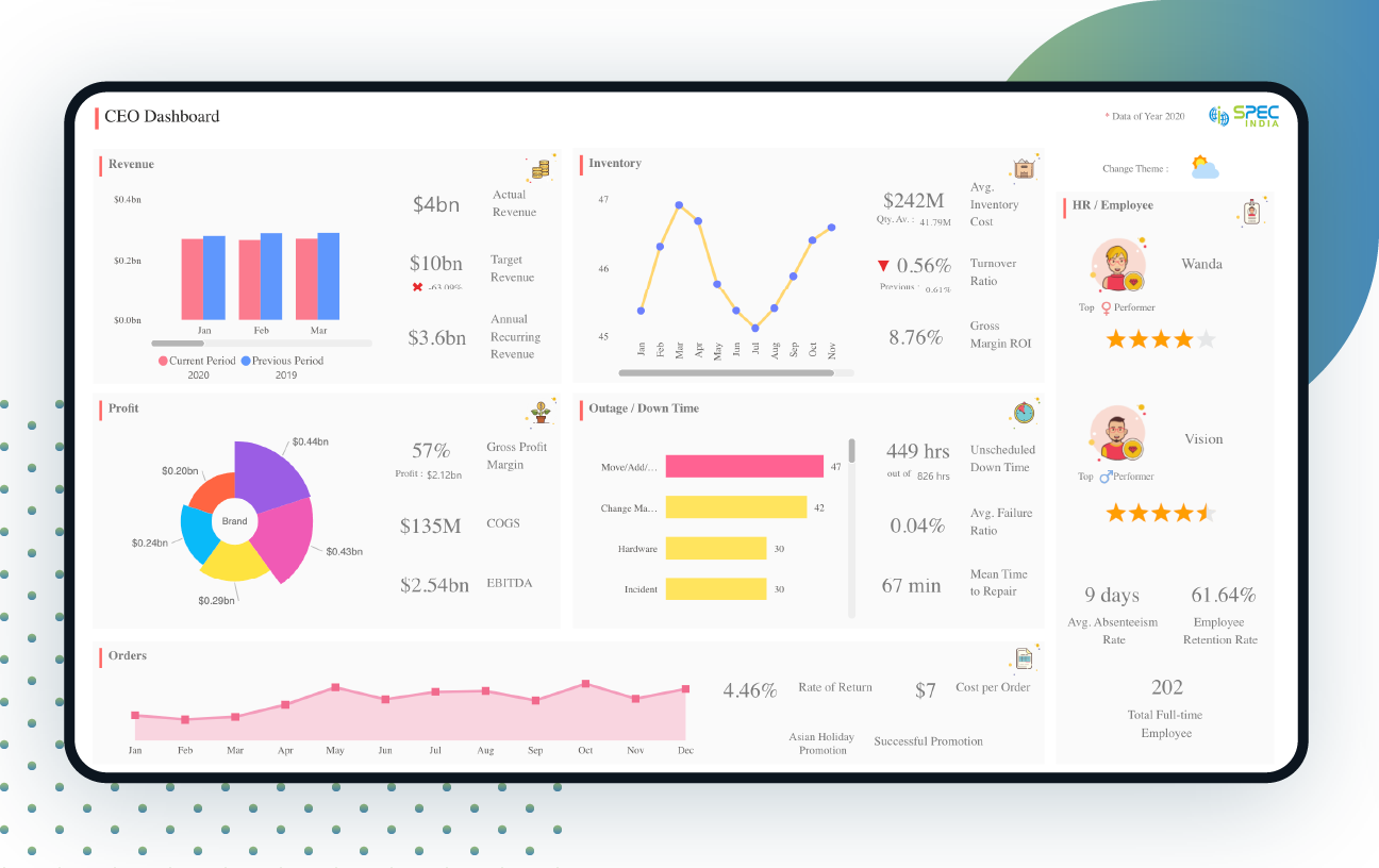
Dashboard Overview
CEO dashboard gives a quick overview of all high-level organizational information and acts as a window into perceiving day-to-day activities and business growth. For CEOs, it is a crucial medium to garner quick visibility into business operations.
Based on critical business areas like revenue, inventory, profit, downtime, orders, and performance, this CEO dashboard in Power BI is categorized into the 6 sections that comprise the main screen. There are two themes available that can be changed based on choice – the day theme and the night theme.
Live CEO Dashboard
Disclaimer: The data, characters and brand names depicted in the visualizations are for demo purposes only. Any resemblance to actual data, or to brand names, is purely coincidental.
CEO Dashboard Features
Revenue
Monthly revenue earned in the current year and previous year is displayed as a double bar chart. You can scroll through the months horizontally and as you click on a particular month; the entire chart data will change data accordingly. As you hover over the months, you can see the monthly revenue figures. Actual revenue, target revenue, and annual recurring revenue are also displayed, and an appropriate sign is indicated as the actual vs target revenue is compared.
Inventory
A line graph indicating month-wise average inventory days in stock is shown. It shows the cumulative average inventory cost, percentage increase/decrease in turnover ratio, and gross margin ROI figures.
Profit
Brand-wise profit is shown as a pie chart, with the brand name and figure being displayed as you hover over the colored part. It shows an aggregate figure of gross profit margin, cost of goods sold, and earnings before interest, taxes, depreciation, and amortization.
Outage/Downtime
Downtime based on different factors that caused the outage is displayed. It displays the aggregate figures of unscheduled downtime out of the total number of outage hours, average failure ratio, and mean time to repair.
Orders
A line graph indicating the number of orders received, month-wise is displayed at the bottom of the page. You need to hover over the month, to view the quantity. It indicates the percentage rate of return and the approximate cost per order. If any promotion is being applied, the name is displayed here.
HR/Employee Top Performers
Top male and female performers are indicated, with their name, photograph, and respective star ratings. Average absenteeism rate, employee retention rate percentage, and total full-time employees are also displayed.

Similar Project Idea?
Unleash the Potential of Business Intelligence with our BI Developers Showcasing Technically Superior Skills
Submit requestAudience
CEOs
Leadership Team
Executives
Sales Team
Marketing Team
KPIs
Net profit
Expenses
Total revenue and sales targets
Employee engagement
HR/Employee Data
Outage/DownTime
Revenues and revenue growth rate
Inventory
More Live Visualization


Looking For Something Similar?
We have worked with some of the best innovative ideas and brands in the world across industries.
Get free consultationLet’s get in touch!
India
SPEC House, Parth Complex, Near Swastik Cross Roads, Navarangpura, Ahmedabad 380009, INDIA.
-
 +91-79-26404031, 32-33-34
 -
 [email protected]
