

Dashboard Overview
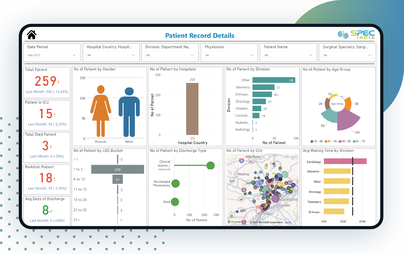
This patient management dashboard showcases a 360-degree profile of patients with demographics and healthcare details.
It transforms data into rich and informative visuals, making decision-making easier and faster for clinics and hospitals. Analysts can select a particular time, hospital country, state, city, and name. They can also select the patient’s name, department, physicians, and other special care.
This powerful patient analytics shows the number of total patients, patients in ICU, patients who died, re-admit patients, average days of discharge, patients by gender & age group. Analysts can gain insights into the number of patients by hospitals, division, LOS Bucket, and discharge type.
It is suitable for hospitals of all sizes. The average waiting time by division with target waiting time helps analysts to decide which division is busier than the other, the highest number of patients, and whether waiting time is appropriate or not.
Healthcare organizations can track real-time performance metrics and demographics of data using this Power BI Patient dashboard to make better decisions.
Live Dashboard
Disclaimer: The data, characters and brand names depicted in the visualizations are for demo purposes only. Any resemblance to actual data, or to brand names, is purely coincidental.

Similar Project Idea?
Unleash the Potential of Business Intelligence with our BI Developers Showcasing Technically Superior Skills
Submit RequestMore Live Visualisation


Looking For Something Similar?
We have worked with some of the best innovative ideas and brands in the world across industries.
Contact UsLet’s get in touch!
India
SPEC House, Parth Complex, Near Swastik Cross Roads, Navarangpura, Ahmedabad 380009, INDIA.
-
 +91-79-26404031, 32-33-34
 -
 [email protected]
