

Top Power BI Visuals: Charts, Tables, Slicers, Maps, And KPIs
“The greatest value of a picture is when it forces us to notice what we never expected to see.”
This was said when data visualization was nowhere in the picture. This saying was from the pioneer of big data and visualization, John Tukey. John Wilder Tukey was one of the most influential statisticians who played a key role in the development of statistics in the mid-’90s. Data visualization has the greatest value now than ever before.
Data visualization is the process of transforming raw data into graphical representation through charts, graphs, and numerous visuals so that it becomes easy to read, understand, and interpret.
Thanks to data visualization and business intelligence tools that made it extremely easier to utilize data to make better decisions. Power BI is one such tool that has simplified data visualization and business intelligence for everyone who has even no data literacy at all.
Microsoft has paved the way for data literacy and data visualization for novice users through tools like Power BI. Power BI visualization enables everyone in the team to understand data and derive insights from the data quickly and efficiently.
We are not going to talk about What Power BI is and comparison of Power BI with other tools. Here, we are focusing on different visualization types in Power BI that have made data interpretation easier, faster, and attractive to the eye.
This guide to Power BI visuals covers everything related to visualization in Power BI and its types – charts, maps, slicers, KPI, and Power BI custom visuals.
Without further ado, let’s begin.
There are many different visualization types in Power BI using which you can present data in a visually appealing and easy-to-interpret manner.
Power BI Visualizations: List of Power BI Visuals
Let’s explore each with the graphical example from the official Microsoft website.
Power BI Charts
Power BI charts are the most popular, widely-used, and easy-to-use visualization type in reports and dashboards. These charts are highly interactive and customizable, offering multi-perspective views of data. Use different types of charts in reports to discover insights and ask questions to data.
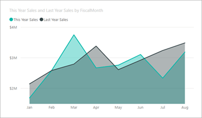
Area Charts
This is a basic chart to show a comparison of more than two quantities. It is based on line chart and used to display quantitative data and the magnitude of change over time. In this chart, the area between the axis and line is filled with different patterns, colors, and textures.
For example, you can show a profit over time through an area chart that lets users know overall changes across the trend.
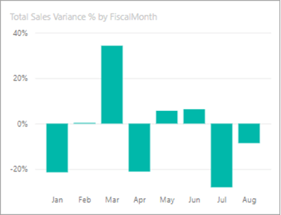
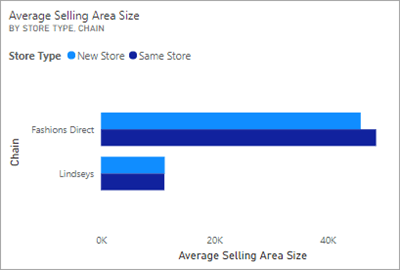
Bar And Column Charts
This is one of the most familiar and standard types of chart used to display specific values across different categories. Bar and Column charts are most common among Power BI Developers to display differences, high & lows, and trends across different categories. Column charts are used to compare the same data by forming some clusters and comparison between those clusters.
Bar Chart-
Column Chart-
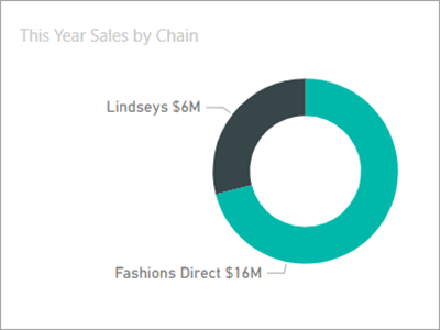
Doughnut Charts
Doughnut charts are similar to pie charts. It is used to display two parts as a whole. You can say that the doughnut chart is a variant of the pie chart. The center of this chart is blank and you can also show different categories as arcs. These charts are different from bar and line charts. They can’t show the changes as bar graphs and line charts.
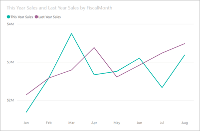
Line Charts
The line chart shows the change of values over time. It represents a series of data points through dots and those dots are connected to each other by lines. Line charts have Y and X-axis to show values on both sides. It is one of the most popular, general, and simple charts to show the overall change of values over time.
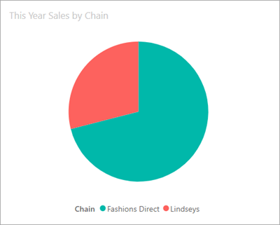
Pie Charts
Pie charts show the relationship of different parts as a whole. It does not have a blank center and is generally filled with different colors as per the parts (a quantitative portion of data). These parts are called slices to introduce the numerical representation of different categories.
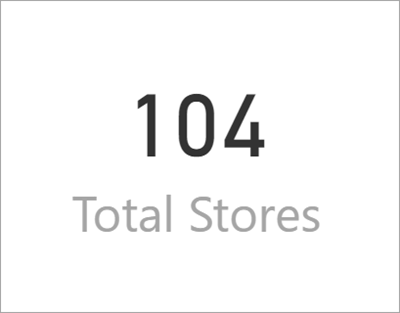
Power BI Card
Cards are used to represent single or multiple data points in a one-per-row format. You can use a single card to highlight a single number that is most essential, e.g., total sales, growth percentage, market share over year, and so on.
Multi-row cards can display one or more data points in an attractive and readable manner.
Multi-Row Card

Single Card
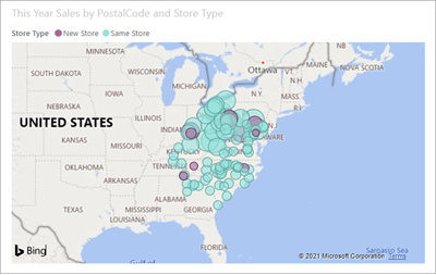
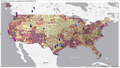
Power BI Map
Power BI integrates with Bing Maps to provide default map coordinates. Power BI is equipped with great features that let anyone create different types of visualization easily and quickly. Map-based visualizations are easy to create and offer a holistic view of spatial and categorical data.
Let’s learn about the types of map visualization in Power BI.
Basic Map
You can use a basic map to display both categorical and quantitative information based on geographical locations.
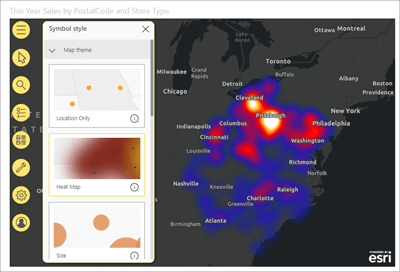
ArcGIS Map
This map is based on GIS (Geographic Information Systems) powered by ESRI. ESRI offers GIS tools to create, analyze, and manage geographical data in a map or database. The combination of ArcGIS and Power BI makes the experience of creating maps better and enjoyable. ArcGIS offers more options for base maps, location types, symbol styles, themes, and reference layers that help create amazing map visuals.
Azure Map
The Azure Map in Power BI can be used to gain insights into the location context of your business. It is estimated that over 80% of business data has a location perspective. Azure Maps visual offers a rich set of data visualizations for spatial data on top of a map. This helps businesses to see how location influences your business data.
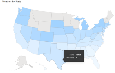
Shape Map
A shape Map is used to show relative comparisons of different regions on a map using different colors. Unlike other maps, you can’t use a Shape map to display precise geographical locations of data points on a map.
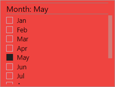
Power BI Slicer
Slicers
Slicers are a type of Power BI on canvas visual filters. Power BI slicers are used to filter the other visuals on the page. Slicers enable users to sort and filter a report and view information selectively (based on available values).
It comes in many different formats and allows users to select only one, many, or all of the available values. It is a great choice to:
- See filtered state without having to open a drop-down list
- Display commonly-used or important filters on the report canvas
- Filter by columns that are not required and hidden in the data table
For example, you have sales reports showing different sales data. Now, if you put a slicer in that report with years as its drop-down values, a reader can select the particular year and that report automatically changes the value based on that year.
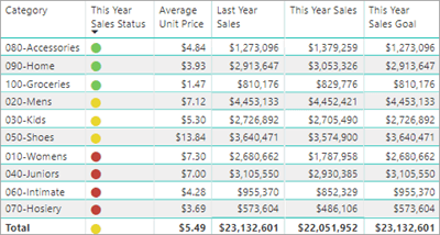
Power BI Table
When there is data, there is a table. Tables need no introduction. It is one of the easiest, widely-used, and standard ways to display quantitative data. The table is a grid that contains data in series of rows and columns. Tables are widely used in the quantitative comparison of data (single category and many values).
Tables are a great choice to see numeric, quantitative, and exact precise values in tabular format.
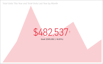
Power BI KPI
Key Performance Indicator is a visual cue that shows visual measures of performance – progress made towards a measurable goal. It helps readers quickly see the status of the metric against a defined target. It is used to gauge the performance of a value defined by a Base measure against a Target value.
Power BI KPI Visual answers two questions – measuring the distance to a goal, and measuring progress – how much progress has been made.
The purpose of KPIs is to help data analysts gauge business objectives and maintain the goal.
For example, the sales department of any company uses a KPI to measure the gross profit ratio against the projected gross profit ratio. It can be used to show expenditure against revenue and even turnover. It is widely used in reports to get a quick business summary, performance analysis or to identify trends.
KPIs in Power BI requires these three values – Base value, Target Value, and Status thresholds.
The list does not end here. Power BI offers many visualization types that help data analysts create interactive, visually appealing, and data-rich dashboards. Moreover, Power BI offers custom data visualizations where you can create your own data visualization using Power BI Visual SDK and a rich library of fully customizable, open-source tools. Let’s see what Power BI Custom Visual is.
Power BI Custom
Generally, there are three different sources of Power BI visuals.
- You can use default visualizations available on the visualization pane in Power BI
- You can import visuals from Microsoft AppSource or Power BI
- You can create your own custom Power BI visual
Requirements to Create Custom Visual Power BI
- A Power BI Pro or PPU (Premium Per User) account
- Windows PowerShell version 4 or later Or Terminal
- Visual Studio Code IDE
- A data report uploaded to Power BI Service
- Power BI visual development environment that requires – Installing Node.js, Installing pbiviz, Installing SSL (Secure Sockets Layer) Certificate, Install development libraries, Enabling custom visual debugging in Power BI service
Now, create a project for the circle card visual.
- Open PowerShell and go to the folder you want to create a project in.
- Enter this command – pbiviz new CircleCard
- Go to the folder – cd CircleCard
- Start the circle card visual – pbiviz start
To test the visual in the Power BI service, you need to sign in to PowerBI.com and open the report of your choice. Here, we are using US Sales Analysis Report available on Github.
- After opening the report, select More Options > Edit.
- Create a new page for testing by clicking on the new page button at the bottom of the Power BI service.
- From the visualization pane, select the Developer Visual. (This visual represents the current custom visual that you are running on your computer. Ensure you have enabled custom visual debugging settings is enabled).
- Visual is now added to the report canvas.
- Go to the Fields pane, expand Sales, and select Quantity.
- Test the visual – this is a simple visual that displays the number of times its update method has been called
The next process is to modify the visuals file and add visual elements and text. You can modify – add or remove a few lines of code as per the official source of this tutorial – Microsoft Power BI Tutorial of circle card visual.
To add shape and text, you will require D3 Scalable Vector Graphics (SVG) format. It provides options to draw different shapes and text elements.
What Do You Need To Do?
- Open visual.ts in VS Code.
- Add the following code to the constructor.
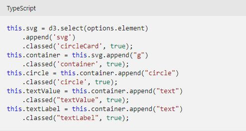
- Save the visual.ts file.
You also need to set the width and height of the visual. Initialize the attributes and styles of the elements. Open your file and add the following code to the update method.
Delete unnecessary lines of code from the capabilities file. Go to the File > Open folder. Select the capabilities.json file and remove all the objects elements. Don’t forget to save the capabilities.json file.
Now, you need to restart the circle card visual. Stop the visual from running from PowerShell and restart it. To test the visual again, open the report and see that your vision is shaped like a circle.
Enable Auto Reload to ensure that your visual is automatically reloaded each time you save your changes. You just need to select Toggle Auto Reload from the floating toolbar.
Moving ahead, modify the capabilities.json file to define data role and data view mappings. To do that, open the capabilities.json file in VS Code. Remove all the content inside the dataRoles array which has a single data role of the type measure. Add the following code to the dataRoles array and save the file.
{

"displayName": "Measure",

"name": "measure",

"kind": "Measure"

}
Now, define a field named measure in the dataViewMappings array. Remove all the content inside the dataViewMappings array and insert the following code to the dataViewMappings array.
{

"conditions": [

{ "measure": { "max": 1 } }

],

"single": {

"role": "measure"

}

}
You need to make changes to the visuals.ts file so that your visual can consume data. Open the file and ensures that the following line is visible in the file. If it is not there, you need to add it.
Import DataView = powerbi.DataView;
Add the following statement in the update method as the first statement.
- let dataView: DataView = options.dataViews[0];
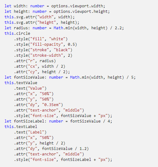
Replace .text(“Value”) with this code.
- .text (<string>dataView.single.value)
Replace .text(“Label”) with this code.
- .text(dataView.metadata.columns[0].displayName)
Save the visual.ts file. The visual is ready now and shows the name and value of the selected data field.
Note: This example is taken from the official Microsoft website.
There are many tutorials available from Microsoft to create custom visuals using different languages. You can develop your own visual, share it for use within the organization, or publish it on AppSource to let the Power BI Community know about that and use it.
Power BI Visuals
Power BI is indeed a great choice for business intelligence capabilities that allow anyone to leverage data to make data-driven decisions. Data management is not enough, you need to utilize it in order to drive organizational growth through strategical, data-informed decisions. Data is everything and it is more than a business requirement now.
You can use tools like Power BI, Tableau, Pentaho, Qlik, Looker, and many more to bring data to life. Power BI is easy to use and easy to learn. It enables users, regardless of their technical background use data to make informed decisions. Self-service BI capabilities, a wide range of data sources, and a powerful community – these are a few things that make Power BI one of the popular BI tools in the market.
“In a world of more data, the companies with more data-literate people are the ones that are going to win.” – Miro Kazakoff, senior lecturer, MIT Sloan
Do you have data-literate people in your organization? What do you do to become data-literate?
We are happy to see that you have reached here!
Do you have something to be added here?
We have tried our best to compile various Power BI visuals.
If you have something new and interesting, you can share it with us through comments.
SPEC INDIA is your trusted partner for AI-driven software solutions, with proven expertise in digital transformation and innovative technology services. We deliver secure, reliable, and high-quality IT solutions to clients worldwide. As an ISO/IEC 27001:2022 certified company, we follow the highest standards for data security and quality. Our team applies proven project management methods, flexible engagement models, and modern infrastructure to deliver outstanding results. With skilled professionals and years of experience, we turn ideas into impactful solutions that drive business growth.
Table of contents
Delivering Digital Outcomes To Accelerate Growth
Let’s TalkTable of contents
Delivering Digital Outcomes To Accelerate Growth
Let’s Talk


Let’s get in touch!
India
SPEC House, Parth Complex, Near Swastik Cross Roads, Navarangpura, Ahmedabad 380009, INDIA.
-
 +91-79-26404031, 32-33-34
 -
 [email protected]
