| Pipeline Stage | What Happens | Common Tools |
|---|---|---|
| Collection | Pull data from EHR, labs, billing, devices | HL7, FHIR APIs |
| Cleaning | Standardize formats, remove duplicates | ETL pipelines |
| Modeling | Structure data for reporting | SQL, data warehouses |
| Visualization | Render charts, maps, dashboards | Power BI, Tableau, custom |


Loading...
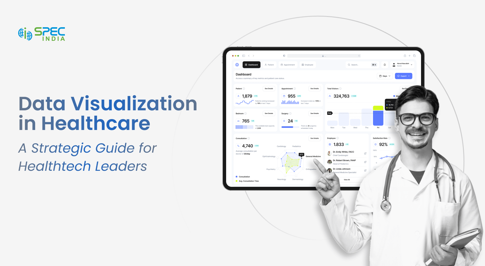
Healthcare Data Visualization: Transform Healthcare Data into Actionable Clinical and Business Insights
Key Takeaways
- Healthcare data visualization turns fragmented clinical, operational, and financial data into clear dashboards that support faster decisions.
- Real-time insights help clinicians spot patient trends earlier, improve intervention times, and support better care outcomes.
- Effective dashboards reduce information overload by presenting the right data to the right users in a simple, role-specific format.
- Data quality, interoperability, privacy, legacy systems, and staff adoption remain key challenges when implementing healthcare visualization solutions.
- Organizations can maximize value by choosing scalable, secure, healthcare-compatible solutions and measuring impact through reporting time, decision speed, and reduced repeat testing.
Hospitals generate close to 30% of the world’s data. A 2026 Knowi report says 97% of it goes unused. That gap is the entire problem. Data piles up in bedside monitors, lab systems, and billing platforms, then sits there unread.
Healthcare data visualization doesn’t create new data. It makes what’s already there visible enough to act on, in the moment it matters.
This article covers three things:
- What healthcare data visualization means
- Why hospitals are adopting it faster than before
- What separates a dashboard people use from one they quietly stop opening
A rough industry pattern is worth knowing upfront: most hospital dashboards see heavy use in the first month, then usage drops off fast unless someone owns the follow-through. The sections below go into why.
What is Healthcare Data Visualization and How Does it Work?
Healthcare data visualization turns clinical, operational, and financial records into charts and real-time dashboards. These make it so convenient that a person can read them in under ten seconds. That’s the bar it must clear to be worth building.
A four-stage pipeline sits behind every dashboard, whether anyone using it realizes that or not:
Most delays happen at the cleaning and modeling stages, not visualization. Patient identifiers rarely match cleanly across three or four systems on the first pass.
FHIR and HL7 integration make step one possible. Skip that groundwork, and the dashboard on top is only ever showing part of the picture.
Refresh frequency matters as much as the pipeline itself. A dashboard that updates overnight is fine for financial reporting. It’s close to useless for bedside vitals, where a six-hour lag can mean the trend has already turned into an emergency by the time anyone sees it.
Most healthcare organizations run a mix of both:
- Real-time feeds for vitals, occupancy, and anything tied to an active clinical decision
- Batch updates, often hourly or nightly, for financial and population-level reporting
Getting this split wrong in either direction causes problems. In real time, everything overwhelms infrastructure and staff alike. Batching everything means clinical decisions are made on data that’s already out of date.
Why is Data Visualization in Healthcare Becoming Essential for Modern Healthcare?
The global healthcare analytics market hit $65.6 billion in 2025. It’s also projected to reach nearly $199 billion by 2033, per Grand View Research.
| Year | Global Market Size | Source |
|---|---|---|
| 2025 | $65.6 billion | Grand View Research |
| 2026 | $81.9 billion (projected) | Grand View Research |
| 2033 | $198.8 billion (projected) | Grand View Research |
Three forces are driving that curve:
- Value-based care ties reimbursement to measured outcomes. These don’t just account for visit volume.
- Staff shortages leave fewer people with time to dig and go through raw reports.
- Patients expect real-time updates on their own care. A callback three days later is something patients don’t appreciate.
Health systems that moved early on this are already seeing the payoff show up in day-to-day numbers, not just strategy decks. A hospital that visualizes discharge planning data, for instance, tends to free up beds faster. This is simply because the bottleneck becomes visible instead of buried in a status meeting.
A quieter fourth driver: healthcare interoperability mandates are pushing standardized data formats across the industry. Standardized data is simply easier to visualize.
Return on investment typically shows up faster than leadership expects, though rarely overnight. Most organizations report measurable gains, like reduced reporting time or fewer redundant tests, within the first two to three months of a dashboard going live. The larger operational shifts take closer to six months to fully settle in.
Building this in-house usually takes longer than teams plan for. That’s part of why hospitals often bring in a healthcare business intelligence partner like SPEC India rather than starting from zero.
What Types of Healthcare Data Can Be Turned into Actionable Visuals?
Five data categories cover most of what a hospital visualizes day to day.
Clinical and Patient Data
Patient vitals and clinical trial data provide healthcare professionals with insights into patient conditions, treatment progress, and outcomes. Data from EHRs, bedside monitors, and research databases can be transformed into visual formats that make trends and patterns easier to identify.
| Data Type | Common Source | Typical Visual |
|---|---|---|
| Patient vitals | EHR, bedside monitors | Line charts, trend graphs |
| Clinical trial data | Research databases | Scatter plots, survival curves |
Operational and Financial Data
Healthcare organizations also visualize operational and financial data to monitor efficiency, capacity, and revenue cycle performance. Bed occupancy data can highlight capacity constraints, while claims and billing data can help finance teams track financial performance.
| Data Type | Common Source | Typical Visual |
|---|---|---|
| Bed occupancy | Hospital management system | Heat maps, occupancy dashboards |
| Claims and billing | Revenue cycle software | Bar charts, financial dashboards |
Population Health and Role-Specific Dashboards
Population health data can be visualized through geographic maps and cohort charts to identify trends across patient groups and locations.
| Data Type | Common Source | Typical Visual |
|---|---|---|
| Population health | Public health registries | Geographic maps, cohort charts |
Healthcare professionals don’t need a claims dashboard. A CFO doesn’t need bedside feed. Each data type feeds a clinical dashboard or operational dashboard, rarely both.
A rough mapping of audience to dashboard focus helps during planning:
| Audience | Primary Dashboard Focus |
|---|---|
| Nurses and physicians | Vital signs, alerts, care plan status |
| Department heads | Occupancy, staffing, throughput |
| Finance and billing | Claims, denials, revenue cycle |
| Executive leadership | Cross-department KPIs and trends |
A common mistake is building one dashboard meant to serve every audience at once. It usually ends up too cluttered for clinicians and too clinical for finance. Separate views built off the same data tend to work better.
Additional Operational Data
A few extra raw data types show up often enough to be worth mentioning, even outside the core five:
- Staffing and scheduling data, usually shown as workforce heat maps
- Supply chain and inventory levels, often tracked as bar or trend charts
- Patient satisfaction scores, typically visualized as rolling averages over time
None of these is core clinical data, but they influence the same operational decisions as vitals and occupancy, which is why mature dashboard programs eventually fold them in rather than treating them as a separate project.
How Does Advanced Analytics of Patient Data Help Clinicians Identify Trends Earlier?
A kidney function reading that drops across three lab draws tells a story a single value can’t. Trends catch problems days before an isolated number would look alarming.
This shows up across specialties in similar ways:
- Sepsis: real-time visualization of vitals and lab trends has shortened time to intervention in several published studies.
- Chronic disease: glucose readings plotted over months. Clinicians don’t check these one by one.
- Cardiology: weight and blood pressure trends tracked between visits.
- Oncology: tumor markers plotted across treatment cycles rather than compared visit to visit.
Early warning scores follow the same logic. When a composite score like NEWS2 is shown as a rising line rather than a single number buried in a note, nursing staff tend to notice the change sooner, especially during a busy shift when there’s little time to cross-reference a chart.
| Specialty | What Gets Visualized | Main Benefit |
|---|---|---|
| Emergency medicine | Vitals, triage scores | Earlier sepsis and deterioration detection |
| Endocrinology | Glucose trends | Treatment adjusted before complications |
| Cardiology | Weight, blood pressure trends | Fewer surprise heart failure admissions |
| Oncology | Tumor marker trends | Treatment response tracked over cycles |
In every case, the pattern carries more weight than any single reading. A pattern only becomes visible once it’s plotted.
Which Data Visualization Formats Work Best for Different Healthcare Use Cases?
Five chart types cover nearly every healthcare use case. Picking the right format helps clinicians and healthcare teams understand important information quickly and reduces the risk of misinterpreting the data.
Visualizing Trends Over Time
Line charts are useful for tracking data that changes over time, such as patient vitals, lab results, and readmission rates. They make it easier to identify whether a measurement is improving, declining, or remaining stable.
Identifying Patterns and Comparing Data
Heat maps help healthcare teams spot clusters, patterns, and outliers in data such as bed occupancy, infection clusters, and staffing gaps. Bar charts are useful for comparing categories, such as department performance or budget versus actual spending.
Mapping Population Health and Relationships
Geographic maps help visualize population health trends and disease outbreaks across locations. Scatter plots can examine relationships between variables, such as length of stay and readmission risk.
Color choice matters more here than in most industries. Roughly 8% of men have some form of color vision deficiency, so a red-versus-green alert can quietly fail for a meaningful share of clinical staff. Shape and position should carry the warning, not color alone.
A quick way to sanity-check a format choice: show it to someone outside the project for ten seconds, then ask what it means. If they hesitate, the chart is probably trying to do too much at once.
| Format | Strength | Weakness |
|---|---|---|
| Line chart | Shows change over time clearly | Poor for comparing unrelated categories |
| Heat map | Spots clusters and outliers fast | Can overwhelm with too many variables |
| Bar chart | Easy side-by-side comparison | Loses nuance in trends over time |
| Scatter plot | Reveals correlation between variables | Hard to read without some data literacy |
How Can Healthcare Dashboards Reduce Information Overload for Clinicians?
Some clinicians see 100 to 200 alerts a day, according to Premier Inc. At Brigham and Women’s Hospital, physicians exceed 98% of medication alerts, per MLMIC.
A well-designed healthcare reporting dashboard fixes this through tiered visibility, not filtering rules:
- Critical items sit in front and center.
- Secondary metrics are one click away.
- Historical data lives in a separate view entirely.
Training plays a bigger role here than most rollouts budget for. A dashboard with perfect data still fails if nobody walks new stuff through it during onboarding, since old habits, like checking the paper chart first, don’t disappear on their own.
A mid-sized hospital piloting this approach on its ICU floor, for example, typically sees alert-related interruptions drop within the first few weeks, simply because staff start trusting the tiered view instead of double-checking every notification against the full chart.
Frequently Asked Questions
As discussed earlier, healthcare is one of the largest data producing sectors in the world. It ranges from patient records to test results and billings to operational metrics. The interpretation and act upon deficiency makes the data overwhelming. If you implement data visualization in healthcare, it simplifies complexities, helps healthcare professionals to take informed decision based on the patient’s conditions, drug developers can make efficient drugs for chronic and severe diseases, and hospitals can improve their operational efficiencies.
Healthcare data visualization has various use cases, which are as follows:
- Clinical Dashboards: tracks trials, lab results, and patients’ progress in real-time
- Operational Analytics: optimize medical staffing, resource allocation, and medical workflows
- Population Health Management: monitor chronic conditions and social health determinants
- Financial Insights: Analyze claims, revenue cycles, and reimbursement patterns
- Telehealth Monitoring: represent remote patient’s data visually from wearable devices
- Research and Trials: monitor drug progresses, visualize adverse conditions, and compare drugs and its side effects
Data visualization has several benefits out of which one is being proactive rather than reactive. With predictive healthcare, you can know in advance about the upcoming conditions. Several crucial benefits are:
- Identifying anomalies like billing discrepancies or unusual vitals
- Helping with proof-oriented patient care through predictive modeling and risk scoring
- Fast insight presentation through interactive healthcare dashboard that presents real-time updates
- Enabling collaboration by offering shared visuals across departments
Healthcare leaders leverage data visualization to develop scalable and compliant analytics solutions for healthcare service providers. They can even upgrade their product offering by integrating insights into CDSS, EHRs, and patient portals. You can even build custom dashboards for your stakeholders. Lastly, it helps in driving digital transformation and differentiates their solutions with enticing and detailed view interfaces.
The best practices that need to be followed for effective data visualization in healthcare are:
- Determining the purpose of visualization, meaning clinical monitoring, operational monitoring, financial reporting, or population health evaluation.
- Ensuring accurate data with zero duplications and leveraging standards like FHIR, HL7, and SNOMED for consistency.
- Customize visualization, use intuitive interfaces and interactive elements.
- Avoiding cluttered visuals to make informed decisions.
- Ensure dashboards are responsive and accessible

SPEC INDIA is your trusted partner for AI-driven software solutions, with proven expertise in digital transformation and innovative technology services. We deliver secure, reliable, and high-quality IT solutions to clients worldwide. As an ISO/IEC 27001:2022 certified company, we follow the highest standards for data security and quality. Our team applies proven project management methods, flexible engagement models, and modern infrastructure to deliver outstanding results. With skilled professionals and years of experience, we turn ideas into impactful solutions that drive business growth.
Table of contents
Delivering Digital Outcomes To Accelerate Growth
Let’s TalkTable of contents
Delivering Digital Outcomes To Accelerate Growth
Let’s Talk


Let’s get in touch!
India
SPEC House, Parth Complex, Near Swastik Cross Roads, Navarangpura, Ahmedabad 380009, INDIA.
-
 +91-79-26404031, 32-33-34
 -
 [email protected]