

What Is Data Visualization? Simplified In 200 Words
‘A Picture Is worth a Thousand Words’. This is what Data Visualization is based on. In organisations packed with huge deluge of data, the most prevalent visual delight is Data Visualization.
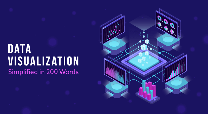
Data Visualization focuses on representing data in different formats. Data Visualization outputs could vary in different formats like dashboards, info-graphics, charts, tables, maps, graphs etc.
The want for Data Visualization is a requisite because for a human eye, a visual picture of consolidated information is highly simple to extract trends and futuristic patterns rather than going through multiple lines of data.
Popular visualization tools are Tableau, Power BI, QlikView etc.
Popular Data Visualization Mechanisms
- Interactive Dashboard – An alluring way to observe your data, search, filter, drill down further to gain deep insights
- Balanced Scorecard – A popular tool that checks for alignment between business activities vis a vis the organizational goals
- Mashups – A seamless integration of information from different sources into a unified graphical interface
The Future
- Interactive visualization and sessions clubbed with facts and figures
- Inter-dependency of qualitative and quantitative data
- Blend of AI and XR to make visualizations more immersive
- Increased usage of live links to videos, research reports etc.
SPEC INDIA is your trusted partner for AI-driven software solutions, with proven expertise in digital transformation and innovative technology services. We deliver secure, reliable, and high-quality IT solutions to clients worldwide. As an ISO/IEC 27001:2022 certified company, we follow the highest standards for data security and quality. Our team applies proven project management methods, flexible engagement models, and modern infrastructure to deliver outstanding results. With skilled professionals and years of experience, we turn ideas into impactful solutions that drive business growth.
Delivering Digital Outcomes To Accelerate Growth
Let’s TalkLet’s get in touch!
India
SPEC House, Parth Complex, Near Swastik Cross Roads, Navarangpura, Ahmedabad 380009, INDIA.
-
 +91-79-26404031, 32-33-34
 -
 [email protected]
