

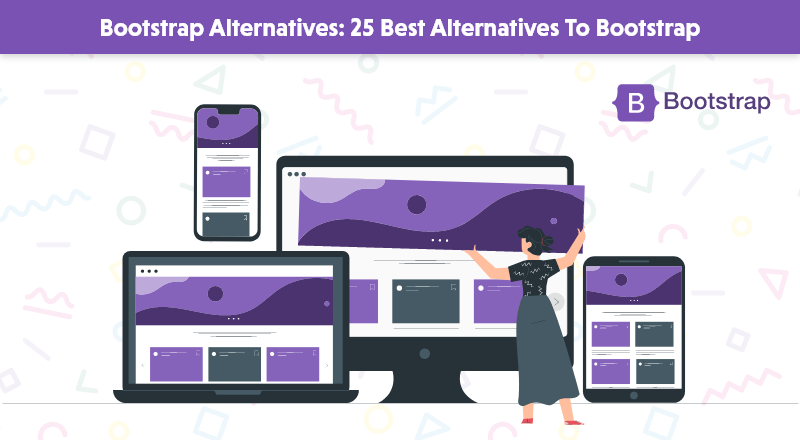
25 Best Bootstrap Alternatives for Your Next Project
The role of a front-end framework is highly significant for faster and more effective for modern web development. In the world of front end frameworks, Bootstrap has been reigning high for quite a few years now. Its broad user base and salient features make it so popular.
But just like everything in this world has alternatives, there are competitive Bootstrap Alternatives that have been receiving rave reviews throughout 2021 and have a promising 2025.
Before we plunge into the details of Bootstrap alternatives that are growing popular, let us have a glimpse of what Bootstrap is.
What is Bootstrap?
Bootstrap is a sleek, intuitive, and popular HTML, CSS, and JS library that can create fast and responsive sites. It offers a customizable and responsive mobile-first experience with a responsive grid system, powerful plug-ins, and elaborate prebuilt components.
It simplifies the development of web pages and is fast and easy to use as a free and open-source tool. It has HTML and CSS-based design templates for different components, such as tables, buttons, typography, forms, modals, navigation, etc.
Specific major components of Bootstrap are labels, dropdown menus, breadcrumbs, navigation bars, button groups, pagination, etc.
Key Features of Bootstrap
- Mobile-friendly and easy to use
- Flexible and offers seamless integration
- Responsive with browser compatibility
- Pre-styled-components and a sound grid system
- Detailed documentation
- Inbuilt JavaScript plug-ins
Top Bootstrap Alternatives To Look For in 2024
1. Skeleton
Skeleton is a simple, responsive, lightweight boilerplate and a CSS framework. It consists of a 12-column fluid grid consisting of rows and columns. It is built with the mobile framework kept in mind. It is easy to start and needs the most minor compilation. It is best for a small project since it styles only major standard HTML elements and considers a grid.
Whatever the screen size, Skeleton considers the layout the major attraction. It offers essential components for the developer, such as lists, forms, buttons, tables, etc. Its grid system fits all kinds of screens—small, medium, and large. Column widths can be automatically resized with a change in one line of CSS. The syntax is easy to implement and provides responsive styles.
2. Bulma
As one of the popular alternatives to Bootstrap, Bulma is a modernized CSS framework that is free and open-source and offers competitive frontend components. It requires no prior knowledge of CSS frameworks, and developers can easily create responsive web interfaces. It has a comprehensive flexbox grid and a wide range of colors and helps build good-looking websites.
Since it is designed with a mobile-first approach in mind, it is 100% responsive. It is modular; you can import whatever you want. It is considered one of the most straightforward grid systems. It is rich in components, modular, easy to learn, compatible, well documented, and constantly enhanced. Hence, developers seek it.
3. Pure.css
Considered a very lightweight framework, Pure.css is apt for small projects since it has several CSS frameworks clustered together. Since it is designed especially for mobile devices, it helps developers build responsive layouts with grids, menus, forms, buttons, etc. Despite being tiny in size, it offers excellent performance and output.
It keeps file sizes small, and each line of CSS code is done with care. It has minimum styles and allows developers to write the application styles on top of them. Elements created by Pure look good on all screen sizes. Pure has a flat design, and hence, it is simpler to append newer CSS rules. The entire appearance can be customized with just a few lines of CSS code.
4. Groundwork
Groundwork is a known responsive HTML5, CSS, and JavaScript framework that helps create scalable web applications that can execute on any platform. It has an efficient fluid grid layout system that is configurable and adaptive and can work with nests. It can work on all kinds of devices and is readily available. It supports semantic markup with ARIA attribute selectors and others.
It is built with Sass, a powerful CSS preprocessor. It keeps source code free from vendor prefixes. It offers rapid prototyping, responsive text, and flexibility. Developers can generate their styles and bolt on other functionalities. It is competent at creating text blocks, responsive headings, etc.
5. Cardinal
Cardinal is a mobile-first CSS framework ideal for creating applications and responsive websites. It offers high performance, maintainability, and scalability. Several helper classes improve the application of styles, lessening development time. It is easy for developers to build a prototype, scale, and create CSS. It offers developers flexibility and creativity.
Cardinal gels well with the most advanced browsers. Its mobile-first approach and the CSS box model make it an excellent alternative to Bootstrap. It has modern-day styles, useful mixins, and variables. Its flexible grid system, utility classes, and gzip compression are some salient features for which it is known to developers.
6. PowertoCSS
PowertoCSS is a lightweight frontend framework ideally designed for front-end development. It can be leveraged to build websites’ grids and even personalized designs. It is designed based on Scalable and Modular Architecture for CSS and is simple to learn with easy class names.
Since it is small and lightweight, it is pretty fast in performance and loading. Developers find it easy to hand handoffers and can offer a good development speed. It is flexible and can be customized as per requirements. Even user-oriented themes can be added. As a simple, light, and responsive tool, PowertoCSS has been offering versatile functionalities.
7. Mueller
Mueller is an excellent alternative to Bootstrap. Its modular and responsive grid system offers practical frontend framework functionalities with its Sass and Compass frameworks. Mueller helps developers create a grid through a grid function. It also helps add classes straight to the elements to keep the HTML elements transparent and neat. It has one default grid and other pre-media grids if needed.
Developers can even extend their media grids to pre-defined layouts. This grid system is considered ideal for creating adaptive and responsive layouts. Customizing those components provides access to media queries, column width, gutter width, and baseline grid. Fractional classes can also be added to grids and layouts. Templates can be added instead of presentational classes in the markup.
8. Bootflat
Bootflat is a popular, open-source Flat UI KIT framework meant to develop attractive web designs. For web developers, it offers a quicker and easier way to create web apps effectively. It is compatible with most modern browsers. This framework’s components are made with HTML5 and CSS3. There is an in-built panel of color schemes for the best customization.
It is created based on the fundamentals of Bootstrap and has a flat design. It is trustworthy and scalable for developers who wish to have proper off-screen navigation with the best performance and lower size. It also has a mobile-first focus, and some plug-ins offer a significant performance boost.
9. Materialize
Materialize is an advanced and responsive frontend framework that is based on the concept of Material Design. It is a UI component library with JavaScript, HTML, and CSS. It follows web design principles like device independence, browser portability, etc. It speeds up development time with its default styling and customized components.
Materialize makes the most of the components and AI animations of Material Design to offer effective feedback to its users. The user experience gathered is collaborative and easy to work with. There are detailed documentation and code examples that help novices learn faster. It provides a drag-out mobile menu, card design, ripple effect animation, Sass mixins, etc.
10. Tailwind CSS
Tailwind CSS is a utility-first, frontend framework that helps you create modern-day websites without leaving your HTML. It has various classes that help create directly to the mar-related kup. It has Utility classes that assist in executing within the system limits. It is a customizable, low-level CSS framework based on utility classes.
It has less stuff in the CSS bundle, and all its utility classes are responsive. It is component-friendly, with which developers find it easy to create their components. Since it is a low-level framework, you can make anything. It becomes simple to create different looks even with the same combinations.
11. HTML5 Boilerplate
HTML5 Boilerplate is like a frontend template with HTML5, CSS3, and JavaScript. Developers can easily, quickly, and robustly create any web page or app. These apps are pretty flexible and come in handy with the needed building blocks. It may not be a complete alternative to Bootstrap, but being a template, it has its advantages in replacing Bootstrap.
It has been designed with an advanced thought process in mind. It has built-in support for web page printing. The documentation is simple to understand, so developers can easily read each line of code. It does not have any layout or component modules. It is used to create HTML5 websites with cross-browser compatibility.
12. Metro UI
Metro UI is a quick and effective frontend framework that follows the fundamentals of Metro Design Language from Windows. It is free and open-source, with a components library based on HTML, CSS, and JavaScript. It has a JS library named M4Q, a substitute for jQuery, and many JS functionalities are created.
Metro UI offers inbuilt internationalization support and is seamlessly operable with other JavaScript frameworks like Vue, React, Angular, etc. Developers find Metro UI relatively easy to use since knowing JavaScript in detail isn’t necessary. It offers full code access on GitHub with a free license.
13. UIKit
UIKit is a modular, responsive framework that is lightweight and easy to use. It has many UI components connected to HTML markup or JavaScript code. It can create pixel-perfect web layouts and powerful, fast web interfaces. It consists of files with all significant UI components, such as icons, fonts, design files, documentation, etc.
It offers interoperable CSS pre-processing with Sass or Less. There is an in-built icon library, and it provides support for right-to-left languages. It is quite a simple framework with a few design components, and developers can easily switch between components as needed. It lets the designers use the modular approach to create the applications.
14. Element
Element is a component-based desktop UI library for designers, developers, and product managers. It is mainly for Vue. Js-based applications. It has reusable and pre-defined Vue.js components. The salient features of this framework are its effectiveness, reliability, feedback, and controllability.
Every UI entity in Element is an Element-based project, including building blocks. The pre-processing feature allows for customizing styles. Element has flexible themes, a Laravel starter kit, inbuilt internationalization support, and wireframing integration. There is also seamless code integration with Sketch/Axure.
15. Onsen UI
Onsen UI is a frontend web, mobile, and hybrid apps framework. It helps developers build mobile apps with web technologies. It has all the fundamental UI components needed to create a mobile app user experience. It also has customizable themes and gives its users a native-like experience.
Onsen UI has strong connections with frameworks like Angular, AngularJS, jQuery, React, and Vue.js. The CSS component is written in Cssnext. It is considered one of the most efficient ways to create HTML5 hybrid and mobile web apps. Developers enjoy the streamlined development with Onsen UI with zero-time setup. It offers a native feel with a lot of ready-to-use components. It is easy to use and possesses automatic styling.
16. Cirrus
Cirrus is a component and utility-based SCSS framework that is entirely responsive with adequate controls and a simple structure. It can easily be integrated with any current design or leveraged for upcoming applications. It can ideally be used for rapid prototyping.
It offers a simplified responsive layout breakpoint for all types of devices. There are two modernized alternatives for layout – flexbox and grid. Since it is open-source and free to use, developers find it easy for different web and mobile projects. There is high-end interoperability with Vue.js.
17. MontageJS
MontageJS is an open-source frontend framework for creating scalable single-page apps. It is a JavaScript framework that simplifies the development of HTML5 applications by applying native application framework fundamentals. MontageJS focuses on code optimization and organization.
It provides a complete software development kit—Montage Studio—for creating and managing modern-day single-page apps. It is easy to manage applications with data bindings. It uses a data-binding library with functional syntax. Developers enjoy the reusable software environment it creates, making it simple for them to test and try the code.
18. Pure CSS
Pure CSS is a tiny CSS framework that can start any project. It helps developers create websites faster and with a responsive layout. It has a minimum footprint and uses Normalize.css to offer styling and design for standard UI components. Since it is responsive, all elements look perfect on different screen sizes. It provides the fewest styles and allows developers to write applications on top of it.
Pure CSS is modular and offers different modules like grids, tables, navigation menus, etc. It uses the SMACSS architecture to modularize the CSS code. Each module is accessible in other files, which are very small and, hence, much more efficient. Pure’s appearance can be customized to look and feel the way you want since it has a flat and minimalistic design.
19. Semantic UI
Semantic UI is a popular framework that assists developers in creating responsive and attractive layouts using HTML. It treats classes and words as interchangeable fundamentals. Semantic uses simplistic behaviors to activate functionality. It helps in writing human-readable HTML code instead of verbose methods.
It is meant to work with various platforms and devices. It has extendable theming, and its JavaScript plug-ins can easily be debugged. The feature of performance logging helps find bottlenecks via stack traces.
20. Flexbox Grid
Flexbox Grid is a well-known grid system centered on the flex display property. It is like Bootstrap’s flex-based system. With it, you can make your web page fluid and responsive. It is easy to learn and grasp. It has a simple syntax: Remember the row, content, and column.
It has an auto width feature that allows you to add several automatic sizing columns to a row. It works better in a single dimension, a row, or a column. It provides space distribution as an ideal option for arranging components in a single column or row.
21. Foundation
Foundation by Zurb is the world’s most advanced responsive frontend framework. It is meant to be effective for any medium or device. It assists developers in creating beautiful responsive websites, emails, and apps that work well with any device. It is customizable, readable, and semantic.
Continuous updates are available to gain the latest features of the Foundation. It has the major components that a good frontend framework must have—grids, buttons, typography, and major UI fundamentals. It also effectively handles HTML emails through the Foundation for Emails.
22. Inuit CSS
Inuit CSS is an extensible, scalable, Sass-based frontend framework for large projects. It gives a perfect architectural framework on which the other components are built. It is free from styles and can be leveraged for all types of projects. It is a mix of OOCSS and BEM frameworks.
Inuit is a wholly structured CSS framework that uses the best architectural methods. It can be downloaded and saved into the project’s CSS directory. It features a grid demo, is a minimal framework, and goes by the Mobile-first framework. Inuit was created to work on tiny screens with the least effort.
23. Jeet
Jeet is a popular grid framework for Sass-based projects. The grids are composed with a semantic markup depending on the utilization of mixins. It facilitates showcasing a page grid without any nesting needs. Developers can create fast applications with less code and more flexibility.
Since the source code is lightweight and uses only a responsive grid system, it is easy to use and understand. It is an alternative responsive framework that focuses on markup, style, and semantics. It has a flexible approach without any additional markup style and is not restricted to any column size.
24. INK
INK is a popular and fast web designing framework for web interfaces. It has a fluid and responsive grid, interactive elements, common interface elements, etc. It has built-in Bootstrap features like typography, mobile-first styling, JavaScript plug-ins, etc. There are pre-formatted cookbooks that can help developers customize a theme and start using it.
It is like an interface kit for faster development and easy usage. There is a good combination of HTML, CSS, and JavaScript for modernized applications, creating layouts, and displaying standard interface components and features based on content and user-friendliness. Owing to these reasons, INK is quite developer-friendly.
25. Kickstart
Kickstart CSS is a crucial CSS library with many components to convert to a completely functional UI framework. It is considered a kickstart boilerplate library. It is faster and lighter than Bootstrap. It has been used in production websites for a long time. It is an ultra-lean, open-source framework that helps developers quickly create web page prototypes.
HTML Kickstart is a collection of HTML5, CSS, and jQuery files ideal for giving developers an excellent start to creating a project. Various elements, such as form styles, super fish-style menus, CSS buttons, typography fundamentals, slideshows, etc., significantly help make the best UI elements. It is lightweight and does not need jQuery to operate.
The Wrap-up
Finally, the final choice of framework depends on the project’s needs and parameters, such as budget, timelines, and skills needed.
Bootstrap has loyal community support, and the abovementioned tools strengthen its user base as the new year comes.
The UI and UX development world has seen many advancements in 2021 and much more in 2024!
Let us wait and watch.
SPEC INDIA is your trusted partner for AI-driven software solutions, with proven expertise in digital transformation and innovative technology services. We deliver secure, reliable, and high-quality IT solutions to clients worldwide. As an ISO/IEC 27001:2022 certified company, we follow the highest standards for data security and quality. Our team applies proven project management methods, flexible engagement models, and modern infrastructure to deliver outstanding results. With skilled professionals and years of experience, we turn ideas into impactful solutions that drive business growth.
Table of contents
Delivering Digital Outcomes To Accelerate Growth
Let’s TalkTable of contents
Delivering Digital Outcomes To Accelerate Growth
Let’s Talk
Let’s get in touch!
India
SPEC House, Parth Complex, Near Swastik Cross Roads, Navarangpura, Ahmedabad 380009, INDIA.
-
 +91-79-26404031, 32-33-34
 -
 [email protected]
