

Healthcare UX: How to Enhance Patient Care Experiences
Have you ever tried using a hospital app or booking a doctor’s appointment online, only to feel confused or frustrated?
You’re not the only one. According to data from sixty percent of people, research indicates that healthcare apps and websites present challenges to users. Countless digital health resources lack essential patient friendliness, which explains why more than 60 percent of users struggle with them.
This blog will explain precisely how healthcare app design and user experience are essential. It will discuss how healthcare UX design simplifies patient interactions by letting them schedule appointments and monitor their reports while receiving automated notification services and engaging in video consultations online.
People use these tools and treatment programs better when the healthcare user experience design remains easy to understand and operate. This leads them to feel more engaged with their healthcare. When systems prove hard to operate, patients abandon their use entirely, thus impacting their medical welfare. Let’s discuss the importance of UX design in healthcare.

Understanding Patient Engagement & Satisfaction
Regarding patient satisfaction, they tell us about their experience through questionnaires, service evaluations, app scores, and face-to-face interactions. A Healthcare UX designer is key in creating digital tools that enhance this experience. The patient engagement process gives individuals the resources to handle healthcare tasks, including booking appointments and making condition management decisions using digital healthcare tools.
Patient satisfaction reviews mainly depend on feedback from patient surveys, questionnaires, smartphone reviews, and one-on-one discussions. Patient satisfaction depends primarily on patients’ ability to get timely care with understandable information, simple digital tools, and excellent healthcare service quality.
Patients who take part in their healthcare journey better follow medical advice while maintaining their health routines. Healthcare providers receive repeat visits from contented patients who gladly promote their services and maintain good relationships with the patient team. Meeting patient needs in care and keeping them engaged helps us build better patient healthcare results through patient-centered care.
What is UI/UX in Healthcare?
How people feel during their interactions with any system creates UX or User Experience. The healthcare industry aims to provide easy-to-access digital health tools so patients who worry or lack technical knowledge can use them easily under stress. A well-designed UX helps patients use digital health tools without hurdles and builds their trust in digital healthcare.
The difference between UI and UX lies in what UI displays visually, while UX ensures smooth operations. Patients will experience a broken UX system with their telehealth app, even when it looks great, because they cannot access test results or schedule appointments. UX must work without difficulties in healthcare settings and further support patients through their emotional and physical healthcare journey.
UX plays a critical role across all digital touchpoints in healthcare:
- Patient portals that allow access to medical records and test results
- Telemedicine apps for remote consultations
- Hospital websites for booking appointments and accessing services
- Mobile health apps for tracking medications, vitals, and wellness goals
- Wearables that provide real-time data and insights
Patients should navigate through each digital platform that helps them exercise their health easily during their journey.
Key Healthcare UX Principles That Drive Patient Engagement
Let’s say you open a healthcare app to check your test results, but nothing makes sense, and you’re unsure where to click. Annoying, right?
Now imagine the opposite: you open the app, and everything is simple, quick, and makes you feel in control. That’s a good UX. Here are some key things that make that happen:
- Make it easy to find things.
Individuals should not waste many steps to reach their goals. Booking appointments and checking prescriptions must require no more than a couple of taps through the application interface. - Use simple, clear language.
Include medical UX terminology only when understanding these terms is required. Patients gain increased self-assurance through complete understanding before requiring assistance. - Show what matters to the patient.
Your mobile app must recognize beneficial content, including medication reminders, appointment notifications, and doctors’ written statements. This approach allows the application to become more customized. - Design for everyone
Different software users come from various age groups and technology experience levels. Create features and text with large buttons and easy-to-use interfaces for all individuals, regardless of age. - Works well on mobile
Many medical patients prefer using their cell phones instead of computers. Users will abandon an app when they find its interface hard to use on their mobile device and when it appears disorganized.
UX Best Practices in Healthcare Platforms
When building a healthcare app or platform, the goal should always be to create a tool that patients enjoy using — one that feels simple, intuitive, and reliable. Here are some of the best ux design practices you can trust –
1. Start with the Patient’s Journey
The patient’s healthcare journey should be considered something to be experienced rather than an individual task requirement. To ensure this, make it easy for your users to avoid getting lost or frustrated during their experience and ensure that the system does not present similar issues. How would your patients use your application system?
- First Impressions Matter: Patients need their first encounter with the app to provide a warm welcome while delivering a straightforward and easy-to-understand experience. Multiple options combined with complicated instructions should be avoided when designing patient experiences. Users must find the essential features for appointment booking, test result analysis, and provider contact directly accessible from the main page.
- Easy, Smooth Navigation: Every step a patient takes should feel natural. It should be seamless whether they find their medical history or book a telehealth appointment. If they must click too many buttons or take unnecessary steps, they’ll likely abandon the task altogether.
- Consider pain points: Understand the patient’s problems when using healthcare apps. Does the app require them to input too much information? Is there any unnecessary complexity? Reduce these friction points to make their experience as smooth as possible.
2. Use Real Patient Feedback
Patients who access healthcare services understand their experience better than anyone else. Direct app usability evaluation from genuine users is the best approach to confirm that the application fulfils their needs and shows user-friendly navigation.
- Beta Testing and Surveys: Testing should begin with real patients who form a small sample before expanding the release to other users. Interactive testing allows you to collect information about patient preferences, system flaws, and the causes for frustration. A straightforward survey serves as an excellent method to obtain significant patient feedback.
- Ongoing Feedback Loop: Gathering feedback continues uninterrupted after your app launches to the public. Employ surveys, in-app messages, and interviews to track how patients experience the application over successive intervals. Collaborating with a Healthcare UX designer during this phase ensures feedback is correctly interpreted and translated into improvements.
- Act on Feedback: The essential objective of gathering feedback is to convert it into action plans for enhancement. The feature design should be evaluated because difficulty in appointment booking or widespread user confusion indicates a need to redesign the feature.
3. Keep the User Experience Design Clean and Calm
In healthcare, the last thing you want is an app or platform that feels overwhelming or chaotic, especially since patients may already be stressed due to their health situation.
- Simplicity is Key: A user-friendly interface built on minimalistic principles and logical navigation operations reduces anxiety while using the app. Users will experience better ease of use when screens contain limited active features and distracting pop-up windows. Keep only the essential keys and simplify all elements.
- Color Scheme and Layout: Select peaceful colors that maintain an easy viewing experience for users. Medically stressed patients experience discomfort from intense colors and contrasting color schemes in user interfaces. Consider soft color schemes that include blue, green, or grey tones.
- Whitespace is Your Friend: The screen requires sufficient gaps between every component for better visualization. An app with too much content in a confined space becomes cramped and complicated to traverse. The design allows patients to focus on essential aspects by providing active breathing space.
4. Add Helpful Prompts and Reminders
Healthcare can be complicated, and patients may forget essential tasks or steps. Clear prompts and reminders can help.
- Guiding Patients Step-by-Step: The app should offer helpful advice when patients need to schedule appointments or provide medical information. Patients booking virtual sessions should receive preparation advice and appointment expectations, including testing their network first and understanding meeting procedures.
- Friendly, Non-Intrusive Reminders: Any healthcare system enhanced through push notifications and automated reminders enables better patient commitment to their health journey. The software must notify patients about upcoming medical meetings, medication resupply dates, and diagnostic outcomes verification times. The reminders must come at the right time and serve a purpose while allowing patients to stop receiving them through simple actions.
- Clear Instructions for Complex Tasks: Some medical tasks, such as preparing for a procedure or telemedicine session, can be tricky. Don’t assume patients know what to do next—walk them through the process with clear and helpful instructions.
5. Ensure Strong Data Privacy
The health-related data handled by these apps remains pivotal, which causes patients to prioritize privacy protection. Your app needs to be secure and transparent about patient data usage since these factors build trust with your users and simultaneously meet legal requirements.
- Transparency About Data Use: The application should describe patient data collection and its utilization purposes using straightforward terminology. Users will show greater confidence in their usage when they comprehend how their data is managed.
- Easy-to-Find Privacy Settings: The privacy settings must remain accessible for patients within the app framework. The application should make privacy settings simple to reach. By letting users control their references, the system provides both authority and reassurance to the users.
- Compliance with Regulations: Your healthcare application must comply with every applicable data protection guideline, especially for American healthcare, such as HIPAA. Patients expect their confidential information to be completely safe throughout digital exchanges with the healthcare system.
Common UX Mistakes to Avoid in Healthcare Apps
A healthcare app with the most innovative concept will fail when the user experience (UX) quality is insufficient due to poor design, which produces patient frustration and confusion that drives them away from using the app.
Here are some of the most common healthcare UX mistakes you should avoid:
1. Too Many Steps to Complete a Task
Users face difficulties when they want to schedule appointments and access their test results because they must navigate through endless forms and various screens. Frustrating, right?
Each additional step increases the risk of users leaving without finishing their tasks.
- Please keep it simple: Patients should have quick access to all medical functions, including appointment scheduling, medical record retrieval, and prescription refills, through streamlined processes. Reduce meaningless interaction points and potential diverting elements to enable users to navigate between screens smoothly. A smooth and rapid method should be the standard for the process.
- Think like a patient: Pay attention to the patient’s mindset since they prefer fast paths to their healthcare goals, regardless of appointment booking or health information viewing. Less is more in this case.
2. Using Medical Jargon
Patients who go to health facilities lack the medical training that healthcare workers possess, which makes medical terms such as “diabetes mellitus” or “hypertension” challenging for them to understand.
- Speak the patient’s language: Use simple, clear language that the average person can easily understand. When explaining test results, medical conditions, or treatment options, break down the information into easy-to-digest words.
- Be empathetic: Patients express both anxiety and vulnerability when handling their health situations. Complex medical terms should not obscure their understanding. The app should be an easy-to-use companion instead of presenting complete technical documentation.
3. Overloading the Screen with Information
Healthcare apps often have much vital information to share, but too much information on one screen can overwhelm patients. Patients who see a cluttered, busy screen with too many details may feel confused or anxious.
- Prioritize information: Show essential data points in front of all other content. The blood test results should be visible in easy-to-understand terms, but additional details become accessible if users wish to pursue further knowledge.
- Use sections or tabs: The information must appear as smaller accessible segments. The information presentation should use group organization or sequential steps that show content one segment at a time. Such an approach enables patients to understand crucial information more successfully.
4. Ignoring Older or Less Tech-Savvy Users
Not everyone is comfortable with technology, especially adults or people who haven’t used smartphones much. Overlooking this demographic can leave many of your users frustrated and less likely to engage with your platform.
- Design for all skill levels: Remember that some users might not be as tech-savvy as younger, more experienced users. Ensure that buttons are large, fonts are easily read, and navigational steps are straightforward.
- Accessibility is key: Ensure your app is easy to navigate for everyone. Features like voice search or text-to-speech can be beneficial. Also, features like contrast settings should be considered for users who may have difficulty seeing specific colours or need larger text for readability.
5. Slow Loading or Bugs
Healthcare apps deal with critical data, so speed and reliability are crucial. If the app takes forever to load, freezes, or crashes regularly, patients may lose confidence and stop using it.
- Test performance: Nothing kills a user’s excitement faster than a slow, sticky app. Make sure that your app is optimized for speed. Patients should be able to access their test results, book appointments, and interact with the app without frustrating delays.
- Regularly update and fix bugs: Regular maintenance is essential. Monitor and fix bugs as they arise. Make sure that when features are added, they do not disrupt the app’s functions.
Real-World Examples of UX-Driven Engagement
The following example demonstrates the core behaviours through which good service engagement works for patients. The success of healthcare apps, alongside patient engagement and improved outcomes, stems from specific user experience implementations in existing healthcare applications.
1. MyChart by Epic Systems
The patient portal application MyChart serves many users by letting patients manage their medical data, including appointment bookings and doctor messages, under one unified platform. The healthcare user experience works intuitively, so users can efficiently access all features through a simple interface.

Key Features
- Clean, easy-to-use interface with straightforward navigation.
- Personalized experience to keep patients engaged with their health journey.
2. Babylon Health
Babylon Health provides users access to virtual doctor consultations using its simplified telemedicine configuration. The app merges real-time doctor chat functions with Artificial Intelligence tracking and assessment capabilities, enhancing users’ individualized experience.
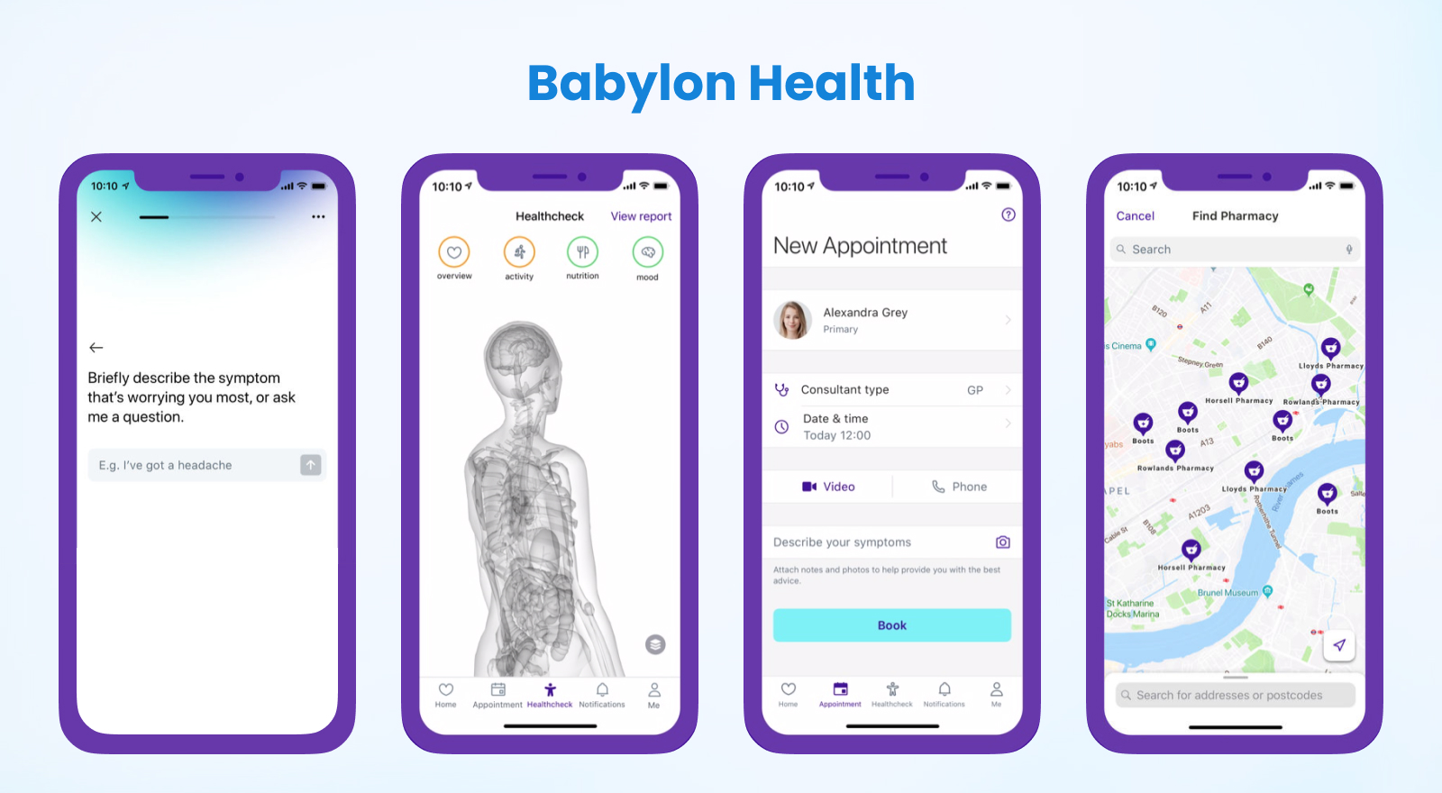
Key Features
- Real-time consultations and health tracking in a few clicks.
- Smooth UX that keeps users engaged and increases retention.
3. Headspace
Users can find mental wellness support using Headspace by practicing mindfulness exercises and meditation. Headspace guides users toward personal wellness through its nice interface, which delivers custom recommendations during easy-to-use sessions.

Key Features
- Calm, inviting design with a simple interface.
- Prompts and reminders to keep users on track with their mindfulness practices.
Final Thoughts
Healthcare user experience means much more than design appearance and interface functionalities. The focus lies in developing platforms that assist patients in better healthcare engagement while producing positive patient results.
Good healthcare UX design choices enable healthcare providers to improve patient appointments, medical information access, doctor communication, and wellness tracking capabilities. A satisfying medical UX goes beyond customer satisfaction because it creates health journeys that reduce tension and increase personal healthcare control.
MyChart, Babylon Health, and Headspace examples demonstrate how UX-driven engagement creates happier patients whose health outcomes improve effectively. The
upcoming technologies, AI alongside voice recognition and AR, bring promising opportunities to healthcare UX design and development for the future.
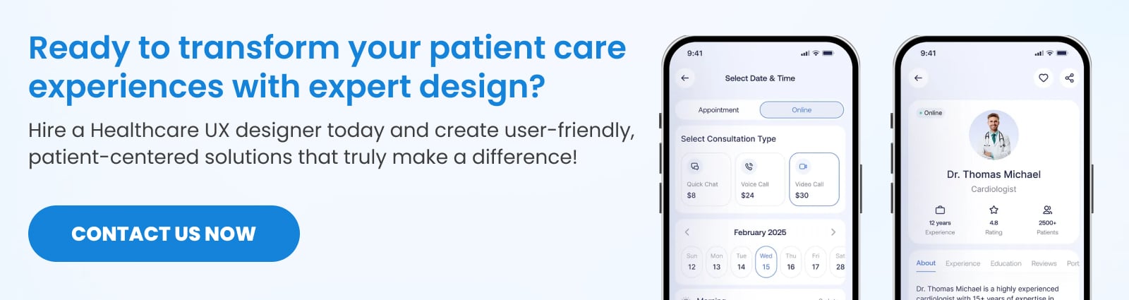
Ready to improve patient engagement through exceptional healthcare UX? Let’s design a healthcare platform that meets your patients’ needs and exceeds their expectations. Contact us today to get started!
SPEC INDIA is your trusted partner for AI-driven software solutions, with proven expertise in digital transformation and innovative technology services. We deliver secure, reliable, and high-quality IT solutions to clients worldwide. As an ISO/IEC 27001:2022 certified company, we follow the highest standards for data security and quality. Our team applies proven project management methods, flexible engagement models, and modern infrastructure to deliver outstanding results. With skilled professionals and years of experience, we turn ideas into impactful solutions that drive business growth.
Table of contents
Delivering Digital Outcomes To Accelerate Growth
Let’s TalkTable of contents
Delivering Digital Outcomes To Accelerate Growth
Let’s Talk


Let’s get in touch!
India
SPEC House, Parth Complex, Near Swastik Cross Roads, Navarangpura, Ahmedabad 380009, INDIA.
-
 +91-79-26404031, 32-33-34
 -
 [email protected]
