 One tree
 One life

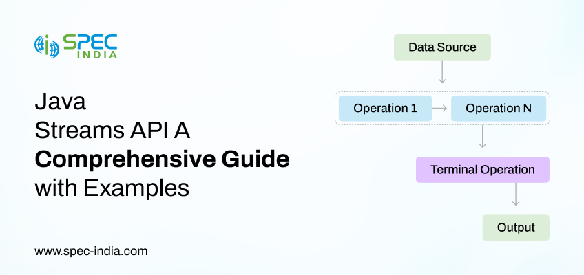
Do you find yourself writing lengthy and repetitive loops just to filter, transform, or sort Java’s collections? Although these conventional...
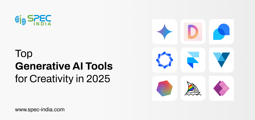
Generative AI’s introduction has been really impactful in the digital transformation sphere. Businesses now opt for Top Generative AI tools...
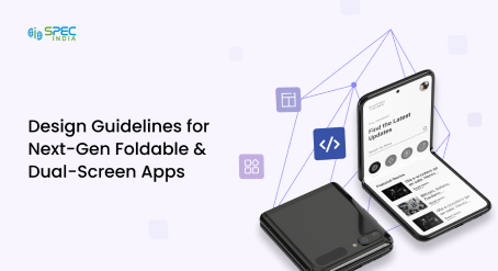
What if your app could open like a book, transform into a mini tablet, or run two tasks side by...

Do you know why so many people give up on learning new languages? It’s because traditional methods weren’t engaging or...

Healthcare providers need to keep pace with fast-changing patient expectations to stay relevant. Modern patient care in 2025 requires more...

Ever been stuck on hold with customer support just to ask a simple question about your bank account? You’re not...
“SPEC House”, Parth Complex, Near Swastik Cross Roads, Navarangpura, Ahmedabad 380009, INDIA.
 +91-79-26404031, 32, 33, 34
  [email protected]
“SPEC Partner”, 350 Grove Street, Bridgewater, NJ 08807, United States.
+1 908-450-9862
[email protected]
This website uses cookies to ensure you get the best experience on our website. Learn more

