

Top 17 Tableau Dashboard Examples For Enhanced Business Decisions

Data gets a new meaning with business intelligence services and BI tools. Tableau is one such powerful BI tool that leads the way. BI tools form the foundation of enhancing any business and business intelligence dashboards are key to leveraging any BI tool.
Tableau produces a variety of insightful dashboards, based on different industry requirements, that enhance business productivity and profitability. Stakeholders from the business segments rely on Tableau dashboards for making critical business decisions.
Certain Tableau Dashboard examples prove the worth of this interactive BI tool. These examples narrate interesting descriptions of how and what data can be displayed and in which format.
This article focuses on a collection of Tableau Dashboard examples that offer a detailed insight into business operations, to showcase the salient features of Tableau Analytics and how Tableau can be instrumental in generating the best examples of Tableau dashboards.
Tableau Dashboard: An Overview
A Tableau Dashboard is a collection of multi-faceted views and worksheets, each of which represents a specialized data package. It is a graphical user interface that offers a quick view of the key performance indicators (KPIs) of the business processes.
Tableau developers create dashboards that allow users to compare a variety of data in a single place for optimal analytics. Tableau dashboards are created keeping in mind the user needs, data prioritization, and choosing the ideal visualization elements.
Tableau offers a lot of tools and approaches to create reliable, crisp, and competitive dashboards. The layout, content, and presentation of the dashboard depend upon the purpose of creating the dashboard.
Tableau dashboards pick up the raw data as needed and transform it into a visually appealing, interactive report output. It offers an effortless user interface with self-service mechanisms that help users to create their own desired dashboards.
Tableau offers innovative features such as filters and tooltips that can be utilized without filling the entire viewable area, thereby, making it a pleasant experience for the users.
What Makes a Tableau Dashboard So Lucrative?
Here are some of the evident reasons why Tableau Dashboards are so beneficial
- Quick assimilation of information saving time and efforts
- User attention and focus with sharing of insights
- Simplified presentation of data in the desired format
- Early identification of outliers with corrective actions
- Getting together disparate data sources with increased visibility
- Serviceability, answerability, interactivity, and decision making
Types of Tableau Dashboards
Tableau Dashboards could belong to the following categories, based on the targeted work area they are looking into:
- Sales Dashboard
- Marketing Dashboard
- Retail Dashboard
- Financial Dashboard
- Executive Dashboard
- Customer Service Dashboard
- Social Media Marketing Dashboard
- Human Resources Dashboard and more
Tableau dashboards can be categorized into the following sections, based on the type of insightful information that they extract:
- Operational Dashboard
- Analytical Dashboard
- Strategic Dashboard
Let us now have a look at some of the examples of Tableau Dashboards that have been widely used and leveraged across the industry segments.
17 Interesting Tableau Dashboard Examples for Garnering Insightful Information
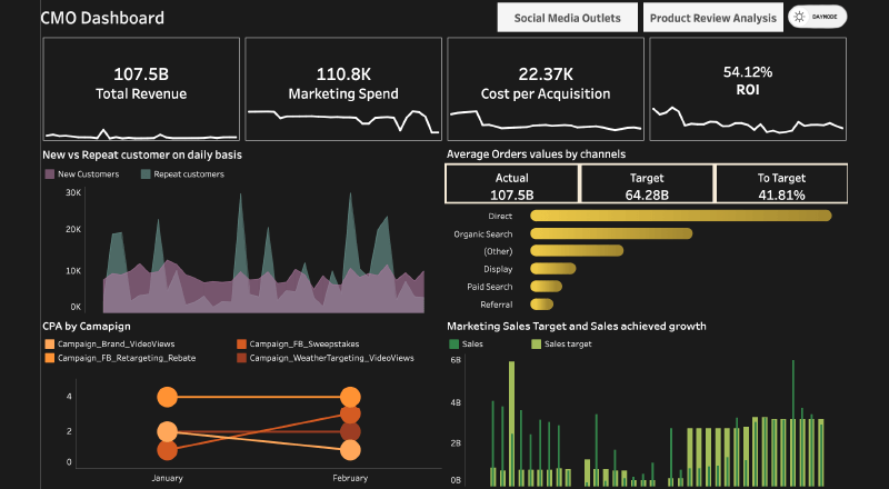
#1. CMO Dashboard
The insightful CMO Dashboard (Chief Marketing Officer Dashboard) is a complete interface for tracking and viewing the efficiency of marketing strategies via various KPIs. It assists in monitoring the website and tracking the overall engagement ratio of the visually engaging dashboard. It offers visualization, tracing, and reporting of critical marketing metrics.
As an ideal example of a Tableau dashboard, it provides a high-level glance at the real-time digital marketing data as needed by the users. It consists of SEO metrics, social media presence, conversions visa ads/emails, total revenue, cost per acquisition, market spend, RoI, etc.
It provides a drill-down view into average order values, new and repeat clients, marketing sales targets, and sales achieved comparison. There is a peep into the social media marketing segment product review analysis and tracking performance on social media.
Ideal for the Marketing team, Marketing directors, CMOs, Board of directors, Owners/CEOs, and Marketing Analysts/Managers.
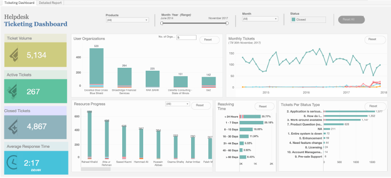
#2. Helpdesk Ticketing Dashboard
As an efficient Tableau Dashboard example, the helpdesk ticketing dashboard offers details about how the helpdesk is managing the tickets with customers. It offers detailed information on all major KPIs and parameters like ticket volume, active tickets, closed tickets, and average response time.
Tickets based on certain status types are shown in a transparent form including the name of the organization, the number of tickets, and its status so that details are quite legible and self-explanatory.
It also shows a summary of resolving time with a range of days with percentages attached to each range. There is a line graph that shows the monthly tickets being generated over a few years.
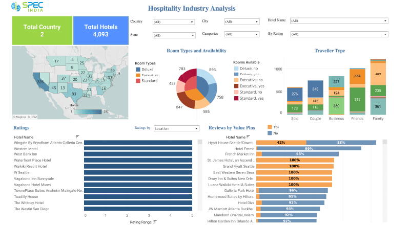
#3. Hospitality Analysis Dashboard
The hospitality industry dashboard, also addressed as a hotel dashboard, is an interactive and visually enriched dashboard that showcases data from different hotels in the USA and India. It caters to major client satisfaction indicators like reviews, and ratings by food, location, facilities, and hospitality.
This dashboard helps users search for accommodation depending on parameters like address, hotel name, ratings etc. It also shows ideal hotels for a traveler group like couples, solo, families, etc. The hotel management can view some rooms occupied and vacant, based on room type – deluxe, standard, and executive. It offers a holistic view of data for better management, measurement, and monitoring. It serves as an effective way to visualize current progress and further growth prospects. It is mainly for use by hotel owners, hotel managers, travelers, travel agents, and prospective travelers.
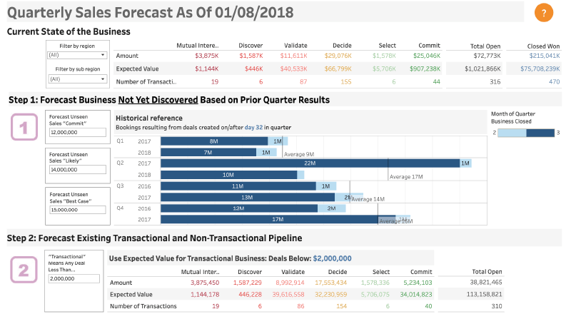
#4. Quarterly Forecast Dashboard
Yet another Tableau Dashboard example is the quarterly sales forecast dashboard that offers a complete picture of the sales pipeline that will help in systematically forecasting sales performance. There are opportunities for the sales segment to grow to offer details about which case forecast would be the best, avoiding unwanted information.
This dashboard serves as a great input to senior sales leaders as it offers accurate information for better data-driven decision-making. It acts as a calculator and functional dashboard for sales analysts.
It portrays key metrics like best case forecast, commits case forecast, likely case forecast, etc. This dashboard can be utilized as and when organizations create a quarterly forecast for sales for comparison of year-to-year performance.
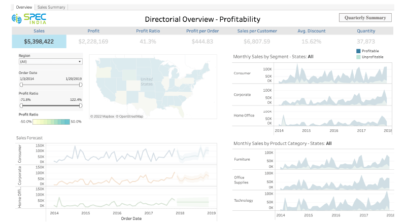
#5. Sales Summary Dashboard
The visually appealing sales summary dashboard helps sales executives track quarter-to-date sales performance and review statistics in the existing quarter and previous ones. There is filtration on the report data based on the product name and opportunity type depending on the data in the CRM.
This dashboard is integrated with the Enterprise CRM tool that offers trustworthy data without the need to go through multiple spreadsheets. Sales leaders can leverage this information and come up with innovative sales strategies to focus on the bigger picture. It is ideal for senior sales leaders to make better decisions in the least time based on the secure and reliable data obtained from the predictive analytics dashboard.
It can be utilized for getting high-level sales information by removing all unwanted details. Some of its key features are current quarter quota, quarter sales, sales quota difference, customer count, and opportunity quantity.
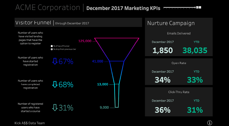
#6. Marketing Funnel Dashboard
The marketing funnel, also known as the purchase funnel, is a customer-focused marketing model that shows the entire customer journey, from the initial steps to the purchase of goods. This intuitive marketing funnel dashboard assists users in assessing their campaigns. It offers details about how well the campaigns are being executed with an increasing number of registrations.
Based on the shape of a funnel, it offers details about the number of campaign emails that are delivered, the percentage of campaign emails that are opened, the number of users who have visited the landing page, and the number of users who have started/completed registration or who have started a course. It also calculates the click-through rate and open rate.
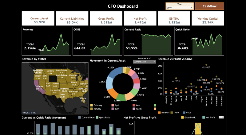
#7. CFO Dashboard
As an ideal Tableau Dashboard example, the enriching CFO dashboard (Chief Financial Officer Dashboard) is a genuine resource of financial information with all significant KPIs. The financial dashboard offers important financial metrics that can judge the overall performance and financial status of the organization.
It extracts financial figures like revenue, net profit, working capital, comprehensive cash flow, current ratio, financial performance, net profit vs gross profit, fiscal information, revenue based on geography, year-wise performance, revenue by location, actual vs forecast, etc.
The key features include reporting on critical financial metrics, cash flow dashboard, Cost of Goods Sold value, EBITDA, company’s inflow, accounts payable and Receivable, Revenue by states, etc, through a series of line graphs, bar graphs, pie charts, and monthly data points. The target audience is chief financial officers, finance directors, board of directors, financial analysts/managers, owners, and CEOs.
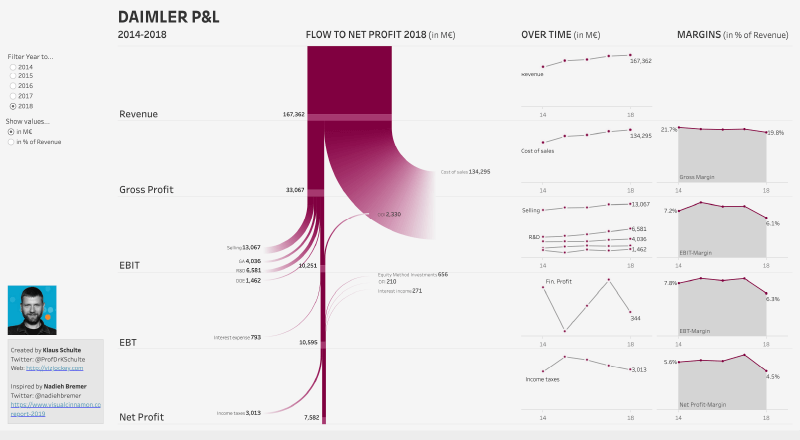
#8. Profit and Loss Dashboard
One of the most useful Tableau dashboard examples, the Profit and Loss dashboard is an easily readable visual representation of the revenue, expenses, costs, losses, and profits experienced by a business over a certain time frame.
It is an apt visualization for senior management to view the revenue earnings before tax, cost of performing sales, earnings after tax, etc. It also shows the shifting developments of different parameters like profits, losses, costs, taxes, etc.
Users can filter data by selecting the requisite year and show the Flow to net profit, Overtime, and Margins as against the basic parameters. It is a Tableau dashboard worth trying to get a constant update of the ever-changing financial information.
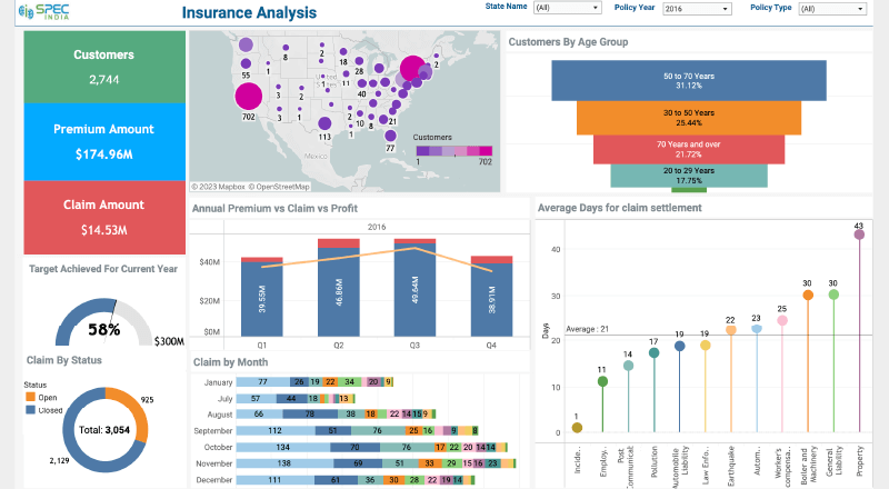
#9. Healthcare Insurance Analysis Dashboard
The comprehensive and interactive healthcare insurance analysis dashboard is one of the ideal Tableau Dashboard examples that showcase data of an insurance company based in the USA. It displays a state-wise report of all clients, claimed/premium accounts, and a gauge chart for showing the progress towards the annual target.
It is an information-rich dashboard that shows customers by age group with their policy type, gender percentage, and years. The company’s overall progress is displayed through the annual premium vs claim vs profit chart. There is a month-wise claim section that helps middle management in finding out more opportunities and weak areas.
Yearly status can be compared, and the time taken for various claim settlements can be analyzed. It offers a direct view of the entire scenario fastening decision-making and garnering insights into the business. It is meant for use by all insurance companies.
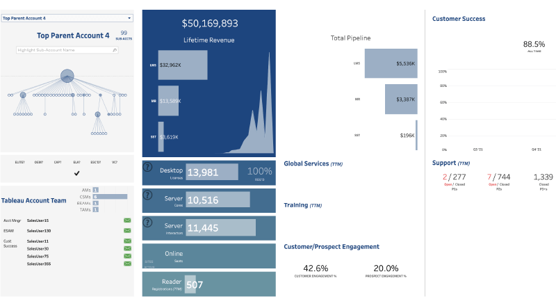
#10. Account Management Dashboard
The innovative account management dashboard is a 360-degree visualization that showcases all major sales indicators on a single screen, for sales users to have an enhanced understanding in a single shot, thereby offering a complete understanding of client accounts.
There is a detailed layout of all parameters of the business such as structure, details of clients that are services, and revenue generation through various customer accounts. This dashboard is ideally meant for managerial staff and sellers so that they can extract business outlines depending on the success of client services and products.
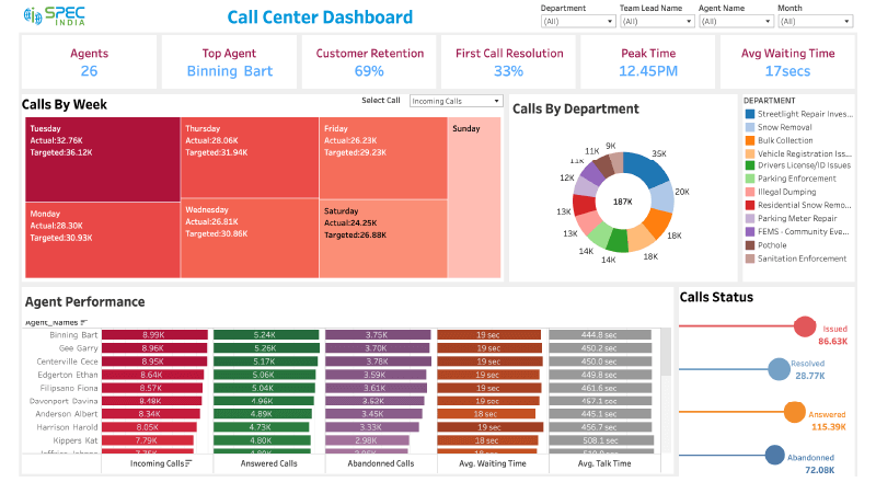
#11. Call Centre Analysis Dashboard
This creative call centre analysis dashboard is for showing data from call centre companies with necessary KPIs and metrics. It displays the number of agents, calls by departments, top performers, client retention indicators, and agent performance with in-depth details of answered calls, incoming calls, talk time, and average waiting time.
It facilitates managers and other authorized teammates in easy monitoring and optimization of the performance of agents. Key information is displayed in an easy and visually attractive format that can be seamlessly integrated with real-time data sources for better monitoring of current performance.
It also analyses the number of call issues, resolved, answered, and discarded. It also calculates the peak time which shows the time of day when the call center received maximum calls. The main aim of this call center dashboard is to enhance client satisfaction and offer the best quality services to customers.
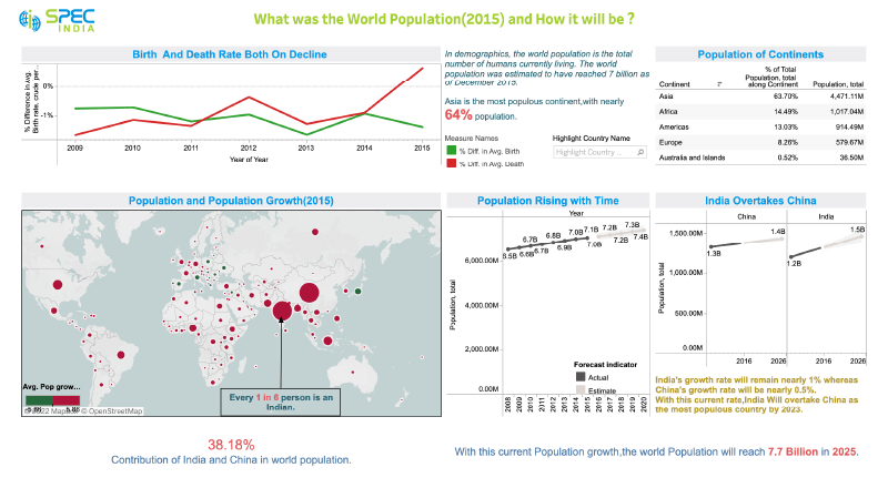
#12. World Population Analysis Report
The world population analysis report is an ideal example of a Tableau Dashboard that shows detailed analytics of the world population in the year 2015 and how the population will increase in the coming years.
This interesting dashboard offers a summary of the data on the growth of the world population for all continents and a prediction of the future population. Being powered by Tableau, it showcases a variety of metrics like total population, percentage of the population, birth and death rate, rise in population year by year, and a vivid comparison between the population of countries.
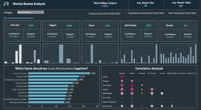
#13. Predictive Market Basket Analysis
From among the many Tableau Dashboard examples, the predictive market basket analysis dashboard offers an affinity analysis of sales patterns for different product categories, subcategories, and items. The market basket analysis is done in R for a popular supermarket chain.
This interactive and visually appealing dashboard shows data to find out customer buying patterns – which items are purchased together, how the purchase of one item in influencing other customers to buy the same item etc. It helps supermarkets to explore opportunities with details like inventory, cross-selling, multipack items, store segmentations, optimized promotion, etc.
The innovative dashboard offers association rules for different categories, subcategories, and items with the help of modernized machine learning algorithms that assist in optimizing marketing strategies in near real-time.
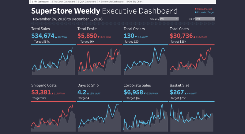
#14. Executive Supply Chain dashboard
The comprehensive executive supply chain dashboard, also called a strategic dashboard, provides a high-level view of business performance for executive staff, across all segments. It shows the total sales, total profit, total costs, and total orders for a certain range of dates, along with the targeted figure in each category.
It also shows shipping costs, days to ship, corporate sales, and basket size, with the target and indication if the figures are below the target or above it.
The KPIs associated with executive dashboards could be different from each other. The dashboard displays the data accurately which the business managers and executive managers can view, with ease. As they can see the target accomplishment, they can take corrective action if they are missing the target.
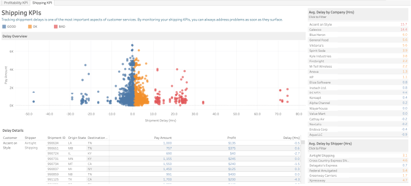
#15. Shipping/Profitability KPI Dashboard
In the world of shipping, a KPI dashboard is an important reporting tool for tracking supply chain KPIs and metrics through a single interface. It is important to track shipment delays and that can be done by monitoring the shipping KPIs.
The general supply chain KPIs are supplier delivery, number of orders, timely delivery, inventory-to-sales ratio, out-of-stock items, shelf life, return rate, delivery frequency, etc. Through this dashboard, the executive management can keep tracking different KPIs like average delay and go into further details of the same.
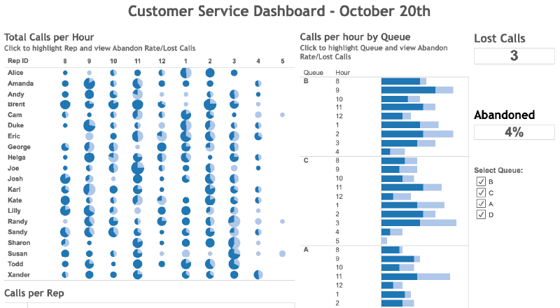
#16. Customer Service Dashboard
As a relevant example of Tableau Dashboard, the customer service dashboard helps in tracking key customer success KPIs and metrics in a unified interface. Some of the KPIs for customer care are average conversion rate, channel performance, first response time, time spent on call, customer wait time, net promotor score, employee engagement, etc.
As a customer service dashboard, it includes total calls per hour, calls per hour by queue, and calls per representative. It also shows the lost calls and abandoned calls. This is ideal for executives and managers to track different KPIs and thereby assess the performance of call center executives.
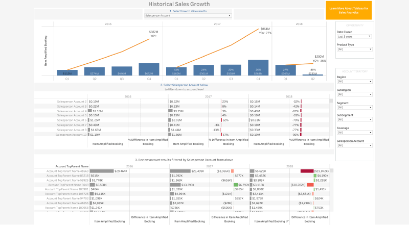
#17. Sales Growth Dashboard
The ever-increasing demand for a sales growth dashboard has always been there. This pipeline dashboard is ideal for sales managers, executives, and analysts. It focuses on major metrics like increased booking percentage, and account level information in a sliced manner.
This dashboard is meant to check on sales goals, which representatives are selling, what are they selling, how much have they sold, etc. The sales growth data is filtered based on region, segment, and salesperson with a detailed comparison based on selected filters. It helps stakeholders identify patterns and trends, set goals, and gain in-depth business knowledge.
Good Read: Top 15 Power BI Dashboard Examples For Better Insights
Conclusion
Be it a customer service work area, marketing strategy, financial sector, healthcare unit, retail sector, or any business segment – Tableau Dashboards are the next-gen visual representation of data available through Tableau consulting services.
The above list explores examples of Tableau Dashboards that have showcased the ease with which a variety of data can be displayed on the screen with actionable insights. Tableau has been a robust BI tool that can leverage the creation of such exemplary Tableau dashboard examples and has a long way to go.
SPEC INDIA is your trusted partner for AI-driven software solutions, with proven expertise in digital transformation and innovative technology services. We deliver secure, reliable, and high-quality IT solutions to clients worldwide. As an ISO/IEC 27001:2022 certified company, we follow the highest standards for data security and quality. Our team applies proven project management methods, flexible engagement models, and modern infrastructure to deliver outstanding results. With skilled professionals and years of experience, we turn ideas into impactful solutions that drive business growth.
Table of contents
- Tableau Dashboard Overview
- Why are Tableau Dashboards Beneficial?
- Types of Tableau Dashboards
- Tableau Dashboard Examples
- CMO Dashboard
- Helpdesk Ticketing Dashboard
- Hospitality Analysis Dashboard
- Quarterly Forecast Dashboard
- Sales Summary Dashboard
- Marketing Funnel Dashboard
- CFO Dashboard
- Profit and Loss Dashboard
- Healthcare Insurance Analysis Dashboard
- Account Management Dashboard
- Call Centre Analysis Dashboard
- World Population Analysis Report
- Predictive Market Basket Analysis
- Executive Supply Chain dashboard
- Shipping/Profitability KPI Dashboard
- Customer Service Dashboard
- Sales Growth Dashboard
- Conclusion
Delivering Digital Outcomes To Accelerate Growth
Let’s TalkTable of contents
- Tableau Dashboard Overview
- Why are Tableau Dashboards Beneficial?
- Types of Tableau Dashboards
- Tableau Dashboard Examples
- CMO Dashboard
- Helpdesk Ticketing Dashboard
- Hospitality Analysis Dashboard
- Quarterly Forecast Dashboard
- Sales Summary Dashboard
- Marketing Funnel Dashboard
- CFO Dashboard
- Profit and Loss Dashboard
- Healthcare Insurance Analysis Dashboard
- Account Management Dashboard
- Call Centre Analysis Dashboard
- World Population Analysis Report
- Predictive Market Basket Analysis
- Executive Supply Chain dashboard
- Shipping/Profitability KPI Dashboard
- Customer Service Dashboard
- Sales Growth Dashboard
- Conclusion
Delivering Digital Outcomes To Accelerate Growth
Let’s Talk


Let’s get in touch!
India
SPEC House, Parth Complex, Near Swastik Cross Roads, Navarangpura, Ahmedabad 380009, INDIA.
-
 +91-79-26404031, 32-33-34
 -
 [email protected]
